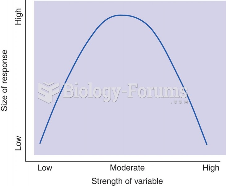
Author Question: What would the correlation coefficient be if all observations for the two variables were on a curve ... (Read 263 times)

jCorn1234

  • Hero Member
  • *****
  • Posts: 545
What would the correlation coefficient be if all observations for the two variables were on a curve described by Y = X2?
 
  What will be an ideal response?

Question 2

For the exercise, use the first 500 observations only. Using data for average hourly earnings only (ahe), describe the earnings distribution. Use summary statistics, such as the mean, median, variance, and skewness. Produce a frequency distribution (histogram) using reasonable earnings class sizes.
 
  What will be an ideal response?


Jayson

  • Sr. Member
  • ****
  • Posts: 350
Answer to Question 1

Answer: The correlation coefficient would be zero in this case, since the relationship is non-linear.

Answer to Question 2

Answer:
ahe

Mean 19.79
Standard Error 0.51
Median 16.83
Mode 19.23
Standard Deviation 11.49
Sample Variance 131.98
Kurtosis 0.23
Skewness 0.96
Range 58.44
Minimum 2.14
Maximum 60.58
Sum 9897.45
Count 500.0

The mean is 19.79. The median (16.83) is lower than the average, suggesting that the mean is being pulled up by individuals with fairly high average hourly earnings. This is confirmed by the skewness measure, which is positive, and therefore suggests a distribution with a long tail to the right. The variance is 2131.96, while the standard deviation is 11.49.

To generate the frequency distribution in Excel, you first have to settle on the number of class intervals. Once you have decided on these, then the minimum and maximum in the data suggests the class width. In Excel, you then define bins (the upper limits of the class intervals). Sturges's formula can be used to suggest the number of class intervals (1+3.31log(n) ), which would suggest about 9 intervals here. Instead I settled for 8 intervals with a class width of 8  minimum wages in California are currently 8 and approximately the same in other U.S. states.

The table produces the absolute frequencies, and relative frequencies can be calculated in a straightforward way.

bins Frequency rel. freq.
8 50 0.1
16 187 0.374
24 115 0.23
32 68 0.136
40 38 0.076
48 33 0.066
56 8 0.016
66 1 0.002
More 0

Substitution of the relative frequencies into the histogram table then produces the following graph (after eliminating the gaps between the bars).


Related Topics

Need homework help now?

Ask unlimited questions for free

Ask a Question
 

Did you know?

Adult head lice are gray, about ? inch long, and often have a tiny dot on their backs. A female can lay between 50 and 150 eggs within the several weeks that she is alive. They feed on human blood.

Did you know?

Sperm cells are so tiny that 400 to 500 million (400,000,000–500,000,000) of them fit onto 1 tsp.

Did you know?

By definition, when a medication is administered intravenously, its bioavailability is 100%.

Did you know?

Most women experience menopause in their 50s. However, in 1994, an Italian woman gave birth to a baby boy when she was 61 years old.

Did you know?

Hippocrates noted that blood separates into four differently colored liquids when removed from the body and examined: a pure red liquid mixed with white liquid material with a yellow-colored froth at the top and a black substance that settles underneath; he named these the four humors (for blood, phlegm, yellow bile, and black bile).

For a complete list of videos, visit our video library