|
|
|

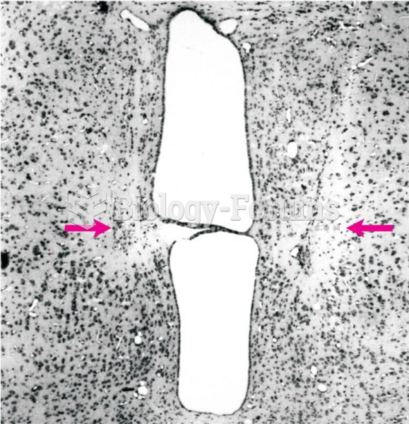 Radio Frequency Lesion
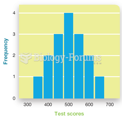 Graphing Psychological Data
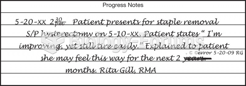 An example of a corrected chart notation.
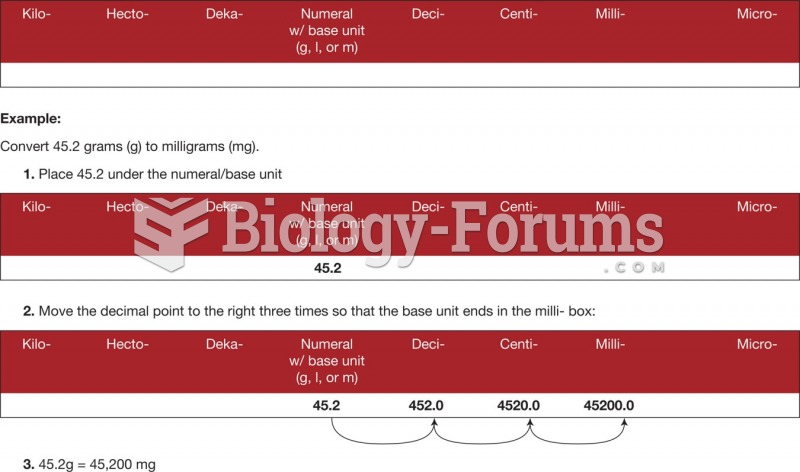 Metric conversion using the place value chart.
 Frequency Analysis of Letters Used in the English Language
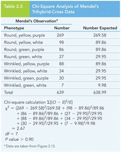 Chi-Square Analysis of Mendel’s Trihybrid-Cross Data