Answer to Question 1
C
Answer to Question 2
To ensure readability of a presentation visual, you should follow these guidelines:
(a) Choose the accent colors that complement the color scheme. Accent colors are used in small doses to draw attention to key elements: bullet markers; bars/slices in graphs, backgrounds (fills) of shapes and lines, selected text; or drawings that are color coded for emphasis.
(b) Choose an appealing font that can be read on-screen easily. Avoid delicate, decorative, or condensed choices that are difficult to read when projected. The clean, simple lines of a sans serif font, such as Calibri, Tahoma, or Verdana, are ideal for projecting on a large screen, newspaper headline, sign, or billboard. A sans serif font has no short cross-strokes, known as serifs, which provide extra detail that helps guide the eye on print media. Examples of serif fonts are Cambria, Times New Roman, and Garamond.
(c) Follow these keyboarding rules for easy reading. Use capital letters sparingly as they are difficult to read from a distance. Capitalize the first letter of important words in slide titles (initial caps) and the first letter of the first word and proper nouns in a bulleted list (sentence case). Omit hard-to-see punctuation at the end of bulleted lists and elsewhere, and avoid abbreviations and hyphenations that might cause confusion.
(d) Reflect legal and ethical responsibility in the design of presentation visuals. Presentation visuals should be uncluttered, easily understood, and depict information honestly.
(e) Proofread the visual carefully following the same systematic procedures used for printed letters and reports and electronic communication. Misspellings in visuals are embarrassing and diminish your credibility. Double-check to be certain that names of people, companies, and products are spelled correctly.

 Burger King burger with hidden message
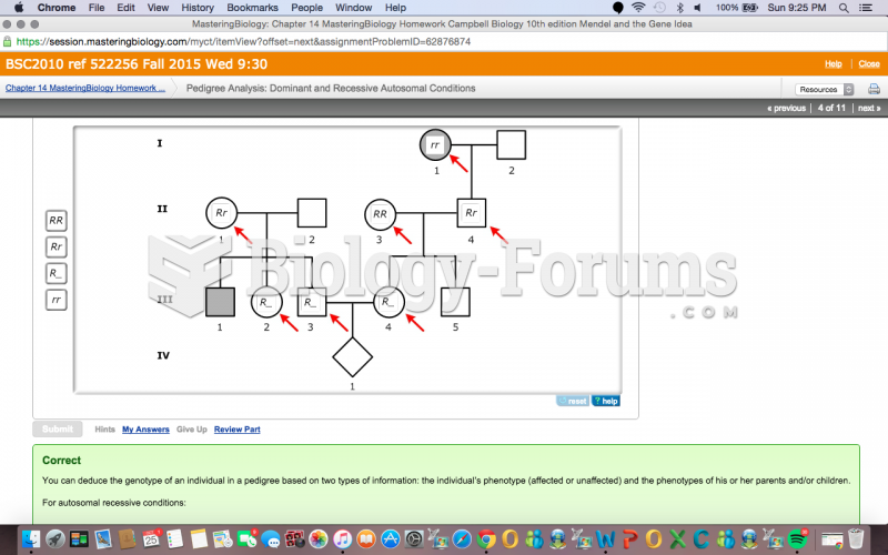 Part C - Determining genotypes in autosomal recessive pedigrees Pedigree 3 from
 Written materials can be helpful for the older adult.
 How to evaluate algebraic terms containing fractional exponents without a calculator
 Determining the order and rate constant of an irreversible first-order reaction
 Evaluate the Limit Question 2