Answer to Question 1
Answer: 850 mb: The distribution of temperatures at the 850 mb level provides forecasters with some useful rules of thumb. During the morning, for example, the 850 mb temperature often provides a good way to guess the daily maximum temperature over nonmountainous areas. 700 mb: Maps of the 700 mb level are best for observing the short waves that are so important in the formation and maintenance of midlatitude cyclones. 500 mb: The 500 mb map is commonly used to represent conditions in the middle atmosphere. 300 mb and 200 mb: Lying near the tropopause, the 300 mb and 200 mb levels have the strongest jet streams. During the colder months, the 300 mb map works best for identifying the jet stream; during the summer, the 200 mb map is best. Rossby waves show up best on the 300 mb maps, which makes the charts useful for determining the rate at which the waves are likely to migrate downwind (or in rare instances, upwind).
Answer to Question 2
Answer: Well over a dozen weather elements, including temperature, dew point, and pressure, are represented on each station model. The surface station model indicates cloud coverage by the amount of shading inside the central circle. A completely open circle indicates cloud-free conditions, a fully darkened one represents complete overcast, and intermediate amounts of shading correspond to varying fractions of cloud cover. A line extending from the circle with tick marks or flags at the end is a wind arrow, or barb, showing the wind speed and direction. The free end of the arrow corresponds to the direction that the wind is blowing from.

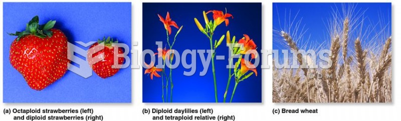 Polyploidy has been an important factor in the evolution of plants.
 Einstein - The important thing...
 The world has been horrified recently at a U.S. Congress so polarized and paralyzed that it cannot p
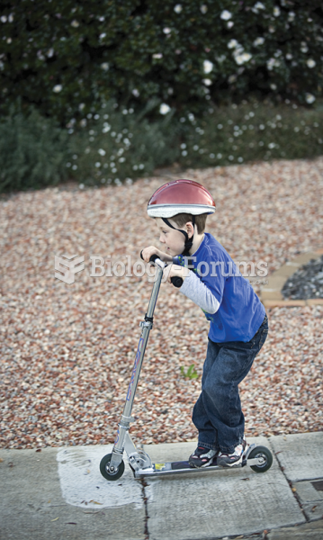 It is important that parents repeat safety rules to preschoolers and monitor compliance with rules.
 Washing hands and removing jewelry are two important safety habits all service technicians ...
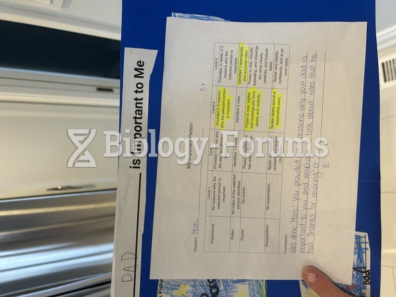 My dad is important to me