Author Question: Discuss six principles to keep in mind when designing visuals regarding the aesthetic and symbolic ... (Read 77 times)

imanialler

  • Hero Member
  • *****
  • Posts: 539
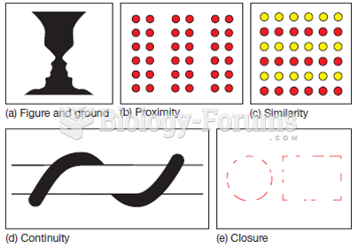
Discuss six principles to keep in mind when designing visuals regarding the aesthetic and symbolic aspects of graphic art.
 
  What will be an ideal response?

Question 2

In a line chart, what do the vertical and horizontal axes normally illustrate?
 
  What will be an ideal response?


jgranad15

  • Sr. Member
  • ****
  • Posts: 345
Answer to Question 1

Answer: Even if you have no formal training, keeping the following principles in mind will help you become a more effective visual communicator: (1) Consistency: Readers view a series of visuals as a whole, assuming that design elements will be consistent from one page to the next. (2) Contrast: Visual distinctions should match verbal ones. To emphasize differences, depict items in contrasting colors, such as red and blue, or black and white. To emphasize similarities, make color difference more subtle. (3) Balance: Images that appear to be out of balance can be as unsettling as a building that looks like it's about to tip over. Balance can be formal, in which the elements in the images are arranged symmetrically around a central point or axis. Balance can also be informal, in which elements are not distributed evenly but stronger and weaker elements are arranged in such a way that achieves an overall effect of balance.
(4) Emphasis: The most important point should receive the greatest visual emphasis, so present the key item on the chart in the most prominent waythrough color, position, size, or whatever. Visually downplay less important items. (5) Convention: Visual communication is governed by a variety of generally accepted (and deeply ingrained) rules. Flouting those conventions can be effective, but must be done carefully in order to avoid breakdowns in communications.
(6) Simplicity: Limit the number of colors and design elements you use, and take care to avoid chartjunk.

Answer to Question 2

Answer: Normally, the vertical axis shows an amount. The horizontal axis illustrates time or some other quantity against which the amount is being measured.
Line charts are commonly used to show trends over time or the relationship between two variables.


Related Topics

Need homework help now?

Ask unlimited questions for free

Ask a Question
 

Did you know?

About one in five American adults and teenagers have had a genital herpes infection—and most of them don't know it. People with genital herpes have at least twice the risk of becoming infected with HIV if exposed to it than those people who do not have genital herpes.

Did you know?

The horizontal fraction bar was introduced by the Arabs.

Did you know?

On average, someone in the United States has a stroke about every 40 seconds. This is about 795,000 people per year.

Did you know?

Immunoglobulin injections may give short-term protection against, or reduce severity of certain diseases. They help people who have an inherited problem making their own antibodies, or those who are having certain types of cancer treatments.

Did you know?

Complications of influenza include: bacterial pneumonia, ear and sinus infections, dehydration, and worsening of chronic conditions such as asthma, congestive heart failure, or diabetes.

For a complete list of videos, visit our video library