This topic contains a solution. Click here to go to the answer
|
|
|

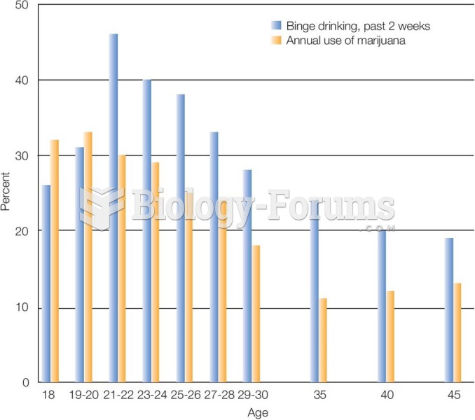 Marijuana Use and Binge Drinking in Emerging Adulthood Rates of most kinds of substance use peak in
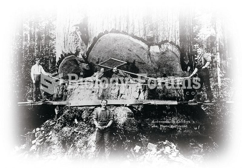 Values, both those held by individuals and those that represent a nation or people, can undergo deep ...
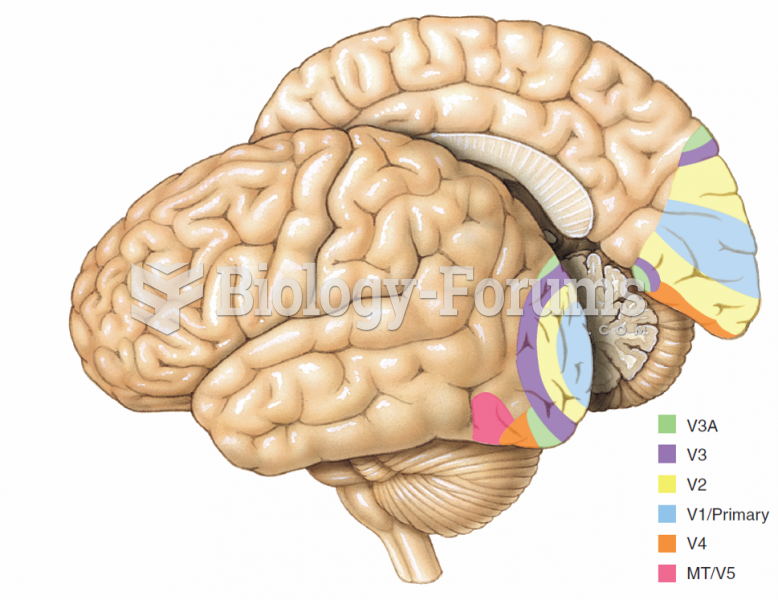 Some of the visual areas that have been identified in the human brain.
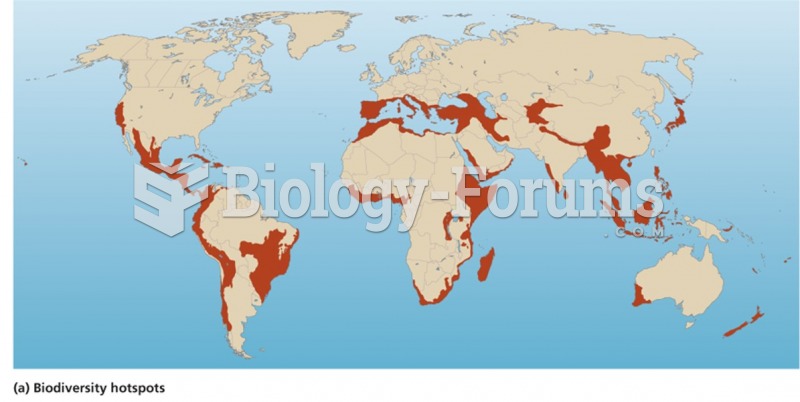 Hot spots highlight areas of high biodiversity
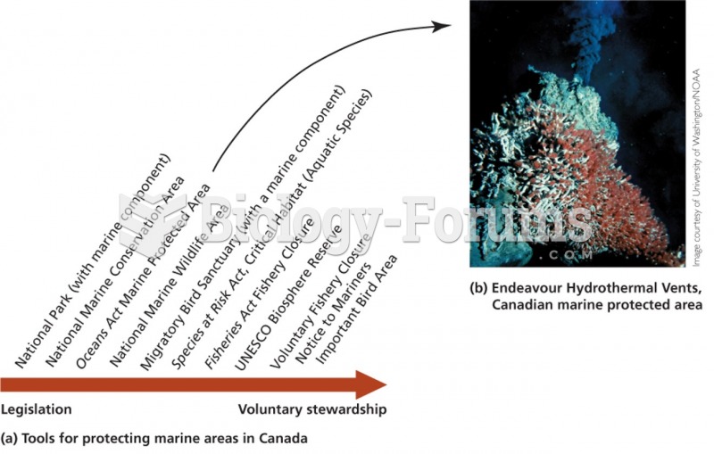 Protection of vulnerable areas in the ocean
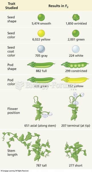 Results of Mendel’s crosses using pea plants. The numbers represent the F2 plants showing a given ...