This topic contains a solution. Click here to go to the answer
|
|
|

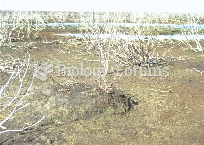 Rapid population growth of geese has resulted in extensive areas of La Perouse Bay becoming d
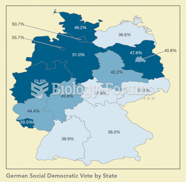 Maps are important tools in political science as they help us see relationships between politics and
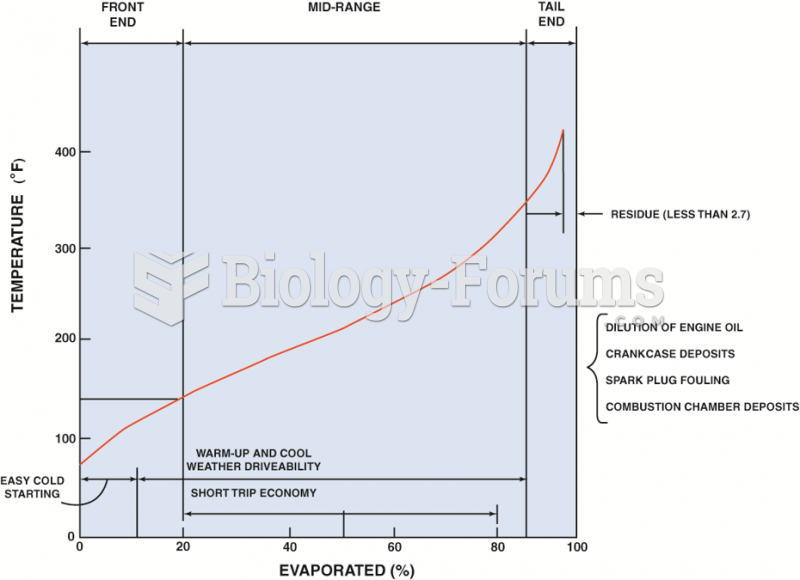 A typical distillation curve. Heavier molecules evaporate at higher temperatures and contain more ...
 Horizontal, sagittal, and coronal functional MRIs show areas of increased activity in the primary ...
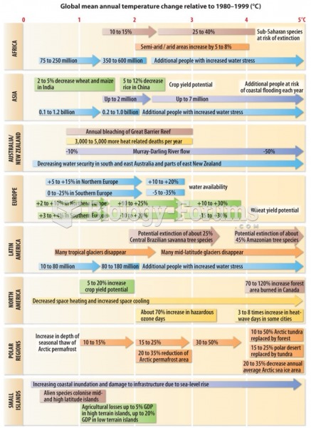 The impact of climate change is greater in some areas than in others
 Christmas Jesus birth kids drawing