This topic contains a solution. Click here to go to the answer
|
|
|

 Paland and Lynch demonstrated the importance of sexual reproduction in reducing the frequency of mal
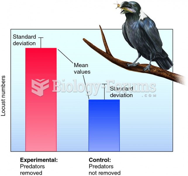 Graphic display of hypothetical results of a predator removal experiment.
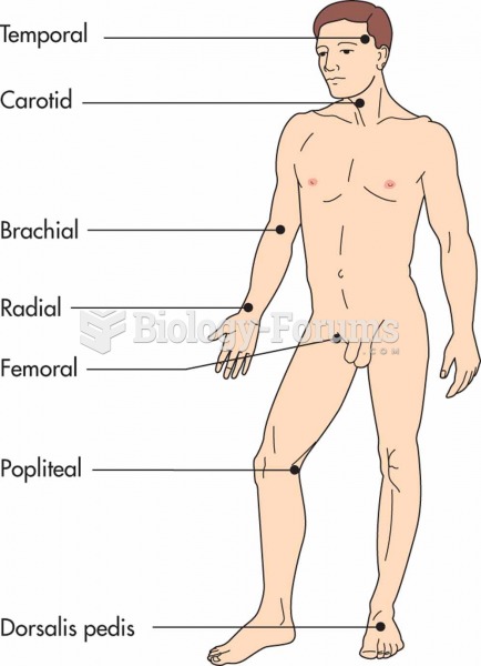 Primary pulse points of the body.
 Mitosis + Check Points 4 of 5
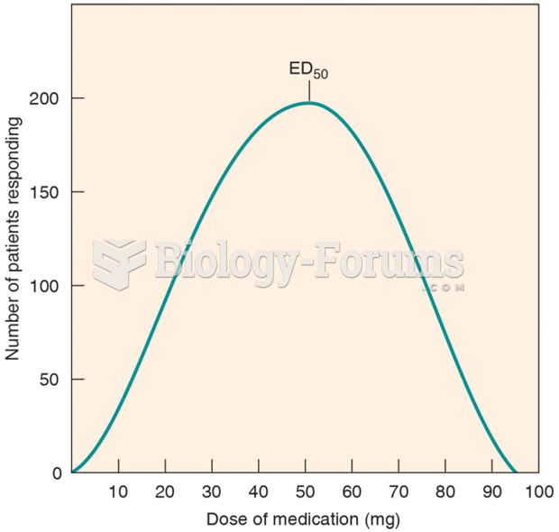 The Frequency Distribution Curve of a Drug
 Frequency Analysis of Letters Used in the English Language