This topic contains a solution. Click here to go to the answer
|
|
|

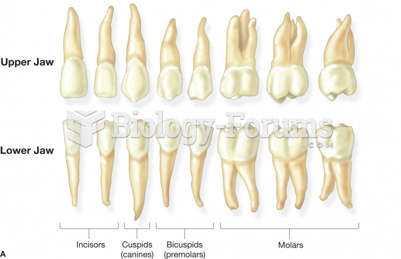 (A) The name and shape of the adult teeth. These teeth represent those found in the right side of th
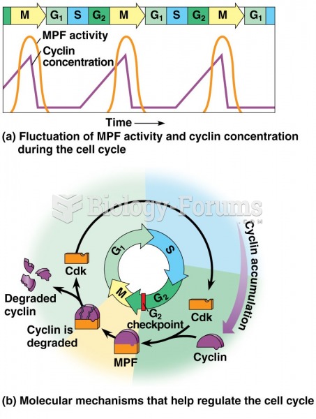 Mitosis + Check Points 4 of 5
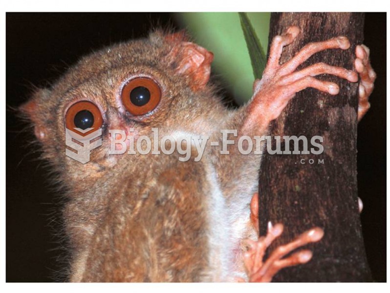 The tarsier is a haplorhine, and may represent an evolutionary bridge between lower and higher prima
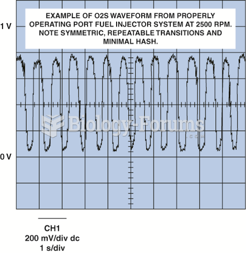 Normal oxygen sensor frequency is from about one to five times per second.
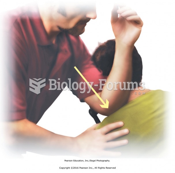 Apply direct pressure to points along the shoulders. Stand to one side and use your forearm to apply ...
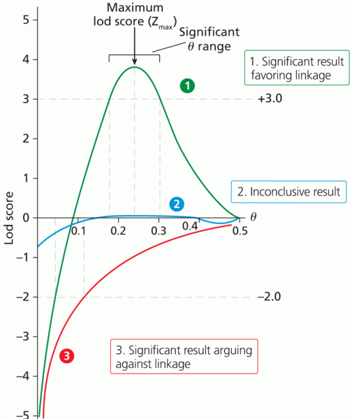 Sample lod score curves