Answer to Question 1
True
Answer to Question 2
Table: used to present quantitative or verbal information in systematic columns and rows
Example: To show a supermarket's sales by department for several years
Bar chart: used to compare related items, illustrate changes in data over time, and show segments as a part of the whole
Example: To show a supermarket's sales by department, side by side, for several years
Line chart: used to demonstrate changes in quantitative data over time, thus indicating trends
Example: To show enrollment at a state university over the past five years
Pie chart: used to visualize a whole unit and the proportions of its components
Example: To show the percentage of each expense as part of a company's total expenses
Flowchart: used to display a process or procedure
Example: To show the procedure employees must follow to file a workers' compensation claim
Organization chart: used to show the chain of command, from the boss down to the line managers and employees
Example: To show where all positions fall within the chain of command
Photograph, map, illustration: used to authenticate an incident, to spotlight a location, and to show an item in use
Example: To show the locations of five new branches that will be built over the next year
Infographic: used to tell a story and allow the reader to make sense of large amounts of data
Example: To create a visual rsum

 Male mandarin duck flying in Dublin, Ireland
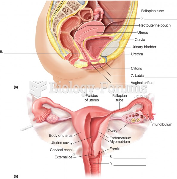 The female reproductive system. (a) Sagittal section through the pelvis. (b) Top view of pelvic orga
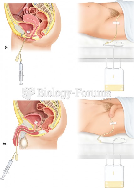 Urinary catheterization. The procedure involves the insertion of a flexible tube, or catheter, throu
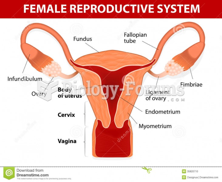 Female Reproductive System
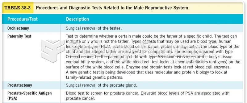 Procedures and Diagnostic Tests Related to the Male Reproductive System
 Male and female Lions (Panthera leo)