Answer to Question 1
True
Answer to Question 2
Table: used to present quantitative or verbal information in systematic columns and rows
Example: To show a supermarket's sales by department for several years
Bar chart: used to compare related items, illustrate changes in data over time, and show segments as a part of the whole
Example: To show a supermarket's sales by department, side by side, for several years
Line chart: used to demonstrate changes in quantitative data over time, thus indicating trends
Example: To show enrollment at a state university over the past five years
Pie chart: used to visualize a whole unit and the proportions of its components
Example: To show the percentage of each expense as part of a company's total expenses
Flowchart: used to display a process or procedure
Example: To show the procedure employees must follow to file a workers' compensation claim
Organization chart: used to show the chain of command, from the boss down to the line managers and employees
Example: To show where all positions fall within the chain of command
Photograph, map, illustration: used to authenticate an incident, to spotlight a location, and to show an item in use
Example: To show the locations of five new branches that will be built over the next year
Infographic: used to tell a story and allow the reader to make sense of large amounts of data
Example: To create a visual rsum

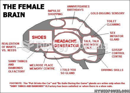 The female brain
 Canvasback - female with ducklings
 Foley catheter with balloon in the bladder of a male patient.
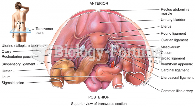 Female Reproductive System