Answer to Question 1
Answer: Conventional charts and graphs are limited in several ways: Most types can show only a limited number of data points before becoming too cluttered to interpret, they often can't show complex relationships among data points, and they can represent only numeric data. As computer technologies continue to generate large amounts of data that can be combined and connected in endless ways, a diverse class of display capabilities known as data visualization work to overcome all these drawbacks. In some instances, data visualization is less about clarifying individual data points and more about extracting broad meaning from giant masses of data or putting the data in context. Data visualization has become an important tool for companies working with big data, a term used to describe massive collections of data from a variety of sources piling up at high speeds. Interactive apps let users drill down into data sets to find details or look at data collections from a variety of perspectives. In addition to displaying large data sets and linkages within data sets, other kinds of visualization tools combine data with textual information to communicate complex or dynamic data much faster than conventional presentations can. For example, a tag cloud shows the relative frequency of terms, or tags (content labels), in an article, a blog, a website, survey data, or another collection of text.
Answer to Question 2
Answer: FALSE
Explanation: Formal balance tends to feel calming and serious, whereas informal balance tends to feel dynamic and engaging.

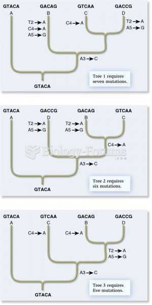 The cladistic approach from molecular genetic data
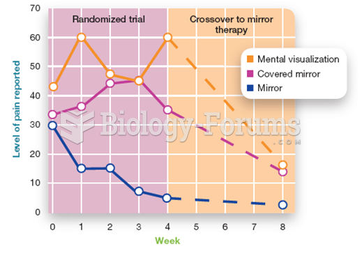 Mirror Box Therapy Compared to Mental Visualization and a Control Condition
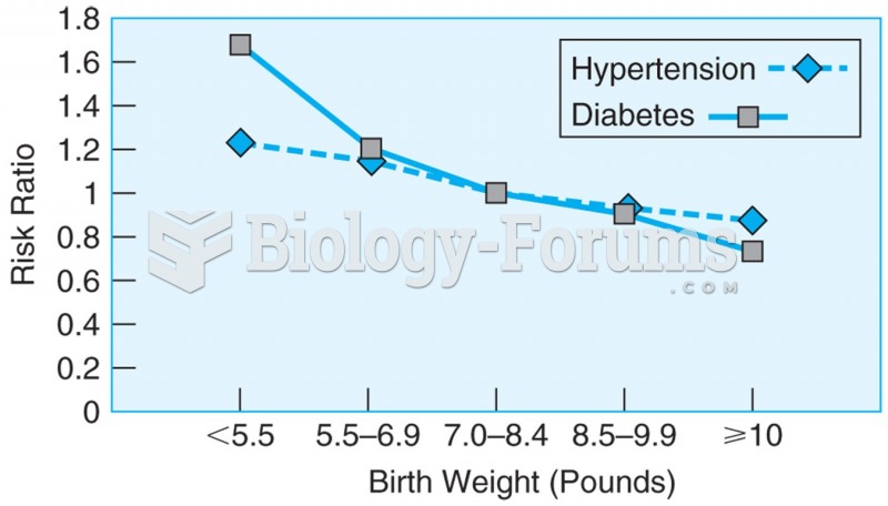 Data from more than 22,000 men over the age of 40, showing the relationship between birth weight and ...
 A typical beginning technician tool set that includes the basic tools to get started.
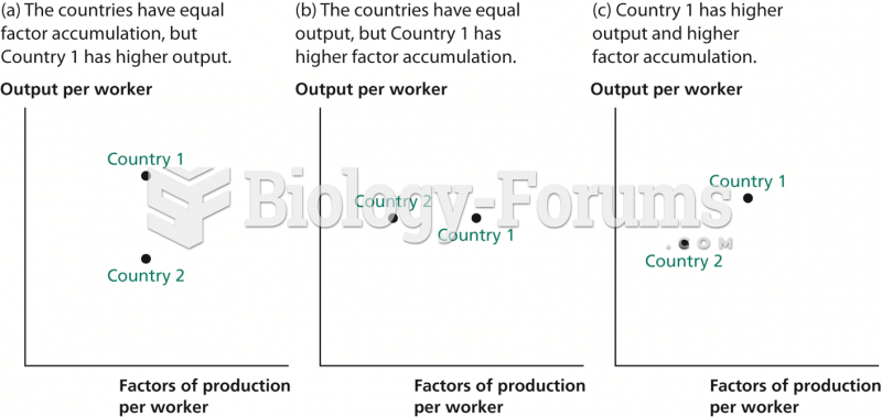 Inferring Productivity from Data on Output and Factor Accumulation
 For the circuit in Figure 1, assume ideal diodes. The peak inverse voltage is approximately