Answer to Question 1
Answer: Even if you have no formal training, keeping the following principles in mind will help you become a more effective visual communicator: (1) Consistency: Readers view a series of visuals as a whole, assuming that design elements will be consistent from one page to the next. (2) Contrast: Visual distinctions should match verbal ones. To emphasize differences, depict items in contrasting colors, such as red and blue, or black and white. To emphasize similarities, make color difference more subtle. (3) Balance: Images that appear to be out of balance can be as unsettling as a building that looks like it's about to tip over. Balance can be formal, in which the elements in the images are arranged symmetrically around a central point or axis. Balance can also be informal, in which elements are not distributed evenly but stronger and weaker elements are arranged in such a way that achieves an overall effect of balance.
(4) Emphasis: The most important point should receive the greatest visual emphasis, so present the key item on the chart in the most prominent waythrough color, position, size, or whatever. Visually downplay less important items. (5) Convention: Visual communication is governed by a variety of generally accepted (and deeply ingrained) rules. Flouting those conventions can be effective, but must be done carefully in order to avoid breakdowns in communications.
(6) Simplicity: Limit the number of colors and design elements you use, and take care to avoid chartjunk.
Answer to Question 2
Answer: Normally, the vertical axis shows an amount. The horizontal axis illustrates time or some other quantity against which the amount is being measured.
Line charts are commonly used to show trends over time or the relationship between two variables.

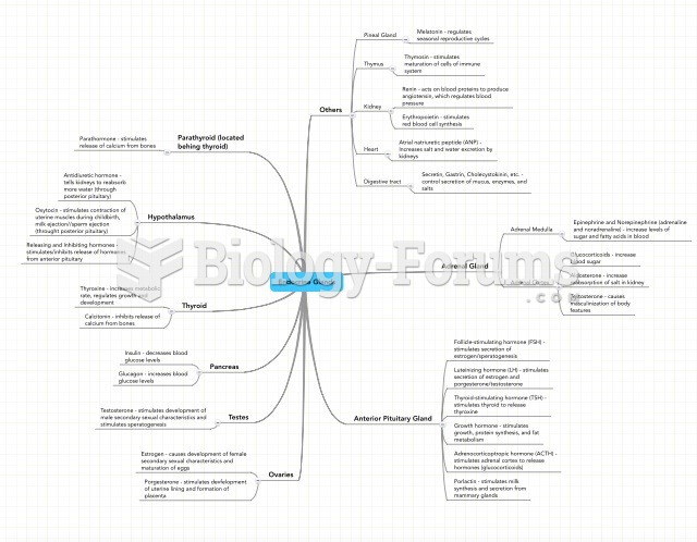 Endocrine system mind map
 AONE guiding principles
 Dresden’s Symbolic Landscape
 A toddler demonstrates symbolic play
 Principles of Macroeconomics and MyEconLab
 Mind over matter collage