This topic contains a solution. Click here to go to the answer
|
|
|

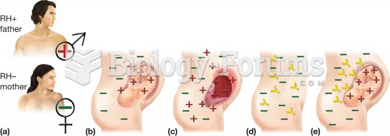 Erythroblastosis fetalis. (a) The condition occurs with an RH+ father and RH– mother. (b) First preg
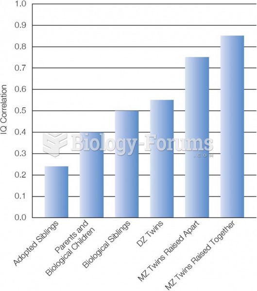 IQ and Genetics The closer the genetic relationship, the higher the correlation in IQ. Based on: Br
 Change in air temperature at various air flow rates for a 2 pass operation
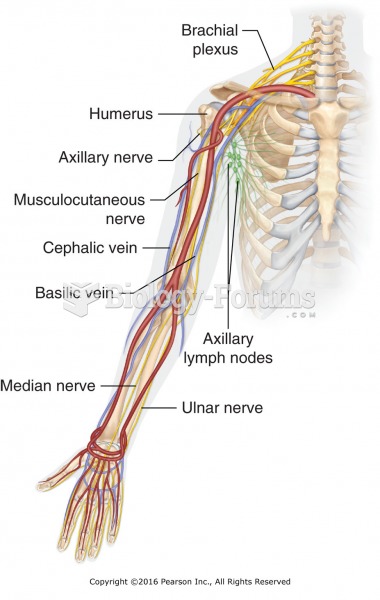 The anterior arm (shoulder, axilla, anticubital, and inner wrist areas). Approach deep pressure in ...
 Auscultatory areas for vascular sounds
 Parents who have higher levels of education encourage their children to be educated