Answer to Question 1
Answer: Although it incorporates some design features, such as headings and bullet points, it does not use more elaborate elements such as borders, multiple columns, call-out boxes, or contrasting fonts. Manuscript-style reports are common in conservative fields, such as banking and accounting. You will also see manuscript style used for internal company reports. Although internal reports must be easy to read, with effective headings and paragraphing, they do not have to be eye-catching. The audience of internal reports typically needs the content and is motivated to read the information.
By contrast, reports that are written for a broader external audience tend to use more design features to motivate the audience to read the report. For example, many organizations produce reports called white papers, which serve as marketing or sales tools. A white paper is a report intended to educate the audienceoften potential customerson a topic that is central to a company's business. Companies publish white papers to build credibility, to establish themselves as experts on a topic, and often to interest the audience in the company's products or services. Because no one is required to read a white paper, the document must entice the audience by the quality of both the content and the visual design.
Answer to Question 2
Answer: Businesses rely on data to make informed decisions. To support those decisions, graphs must display data ethically and not mislead the audience. Graphs can mislead in many ways. For example, they can manipulate the scale, distort perspective, and show data out of context. Even if graph designers do not intend to be dishonest, they may make design choices that result in bad graphs. As Naomi Robbins, an expert in data visualization, says, The designers of many of the graphs we see daily pay more attention to grabbing the audience's attention than to communicating clearly and accurately. They choose design options that they think look better but are actually graphical mistakes, since they mislead or confuse their readers. Because ethical representation of data is so important, many organizations have developed guides to data ethics.

 Charles Darwin may be dead and gone but a recent write-in campaign has pitted him against Republican
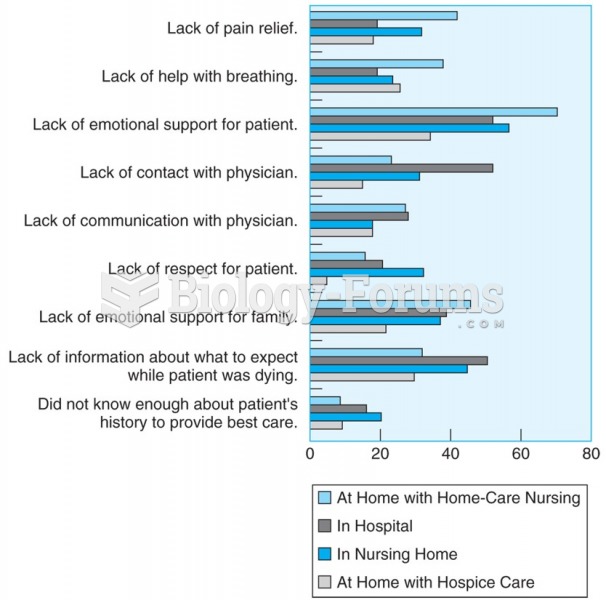 After the death of a loved one, family members report concerns about last place of care.
 Write the equation for the population y at any instant
 How to write a quadratic equation in standard form when a graph is given
 The Kinsey Report on American Women
 Write in vertex form by completing the square