This topic contains a solution. Click here to go to the answer
|
|
|

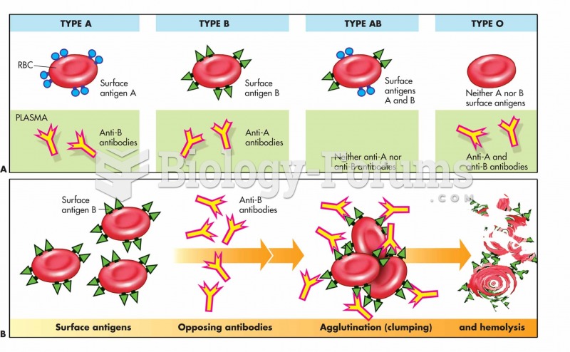 Blood-typing and cross-reactions: The blood type depends on the presence of surface antigens (agglut
 The Taung Child, the first of the australopithecines to be discovered, is the type specimen for Aust
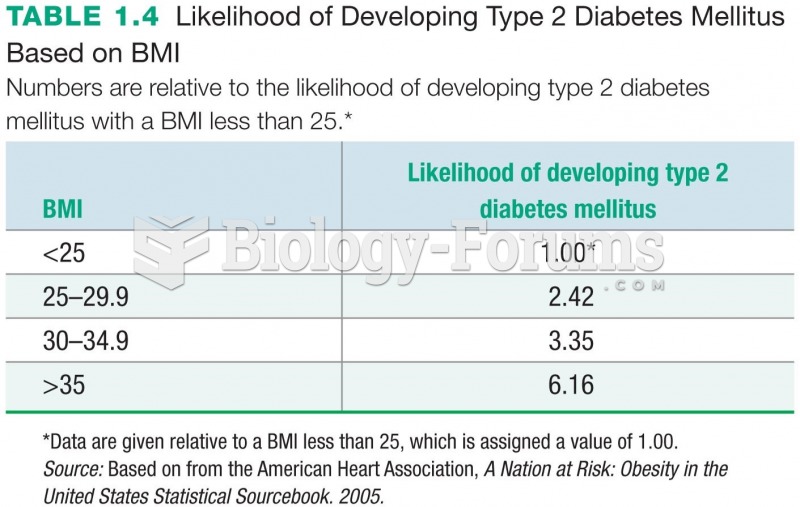 Likelihood of Developing Type 2 Diabetes Mellitus Based on BMI
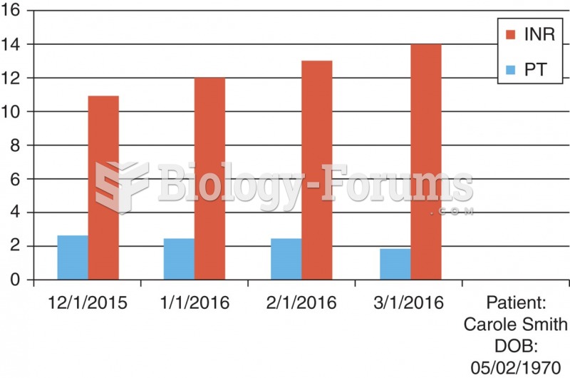 A chart derived from a flow sheet.
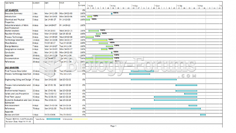 Gantt Chart
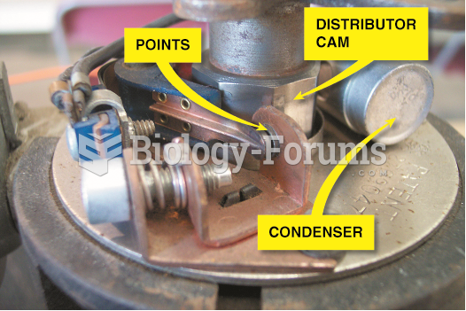 A point-type ignition system showing the distributor cam which opens the points