This topic contains a solution. Click here to go to the answer
|
|
|

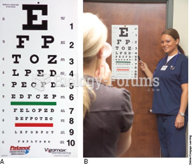 Snellen chart
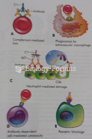 Type II Tissue Specific Reactions
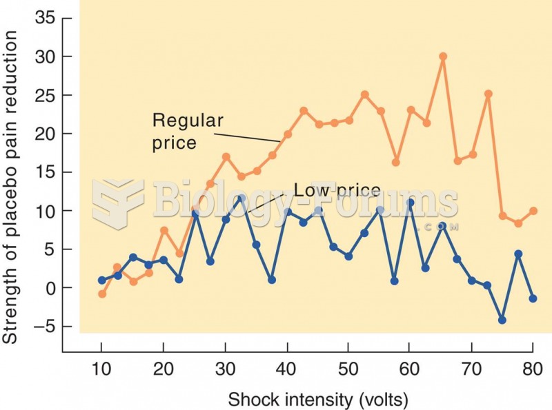 Effect of Perceived Price of a Drug on Placebo Analgesia
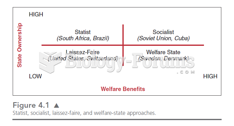 This chart illustrates the four quadrants in which we can place the relationships between the state
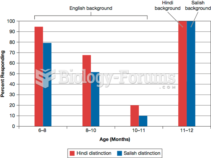 Phoneme Perception in the First 12 Months
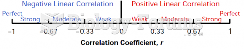 Correlation Coefficient, r (Chart)