Answer to Question 1
The following are general points to address in an improved design of the menu. Actual designs and mock ups will vary greatly, and there is no one correct new design. However, an improved design will most likely address the following issues.
The overall look and feel of the menu is not professional and does not contribute to the creation of an image or ambiance to the establishment. The prices on the menu suggest that this is an upscale, casual dining establishment, and that is consistent with management's wishes, as well. However, the menu's cartoonish fonts, inconsistent capitalization, and occasional grammatical transgression speak to an apparent lack of professionalism, and creates doubt about the upscale' nature of the operation. In addition, the copy associated with each item is often not informative (it does not provide even basic information about an item's preparation method or flavor profile), and does nothing to help merchandise dishes or improve the image of the establishment. For example, the term special is used repeatedly to describe the various sauces used across many dishes, but the word is neither informative nor convincing as integrated into the text. Descriptive copy should inform on why a sauce is special.
One of the reasons why items are not described well on the menu is that there is simply too much uninformative copy on the page. With the variety of proteins (beef, chicken, pork, shrimp) and starches (fun, vermicelli, noodles, rice, mein), very similar items and options end up being repeated. The menu for all the eighty plus items offered, does not actually offer a truly diverse selection just a lot of variation on a few dishes. In addition, the inclusion of a Vietnamese translation on each item and protein choice multiplies the amount of text presented without providing much more information. Options such as choices of protein, starch or sides should be consolidated under menu category headings to help reduce menu clutter, prevent repetition and to make the menu more efficient to read.
The use of color on the menu also does not contribute to the improved readability, search-ability, or merchandising ability of the menu items. Because the menu was printed in-house, and a color inkjet was used, the menu's pages were not coated or protected from water, and as a result, many of the menus showed water damage and smeared ink-jet ink (you would not be able to discern this from the reproduced menu given in the case). In addition, since multiple types of menu should be printed to meet the needs of various customer groups, it may be more cost effective to print the menus in-house. And since the menu does not make good use of color (and there is little reason to require color for this menu) management should print the menu in house on a mono-chromatic laser printer.
While the menu categories describe the items they contain, a better distinction needs to be made between Soups and Noodle Soup sections it appears that one section is for appetizer/starter soups, while Noodle Soups are full meal soups. In addition, the service style of the establishment is confusing it is unclear whether entres are served family-style (as typically served in an Asian dining room), or as individual plates (as is typical for Western dining rooms). Many entre descriptions include sides of vegetables and salads, and there is no mention of whether rice is included with the meal. This dining style confusion can be resolved with the use of separate default and translation menus each aimed at different target markets with different expectations of the dining experience.
Answer to Question 2
D

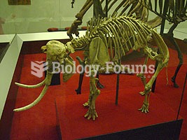 The skeleton of a dwarf elephant from the island of Crete. Dwarf elephants were present on some Medi
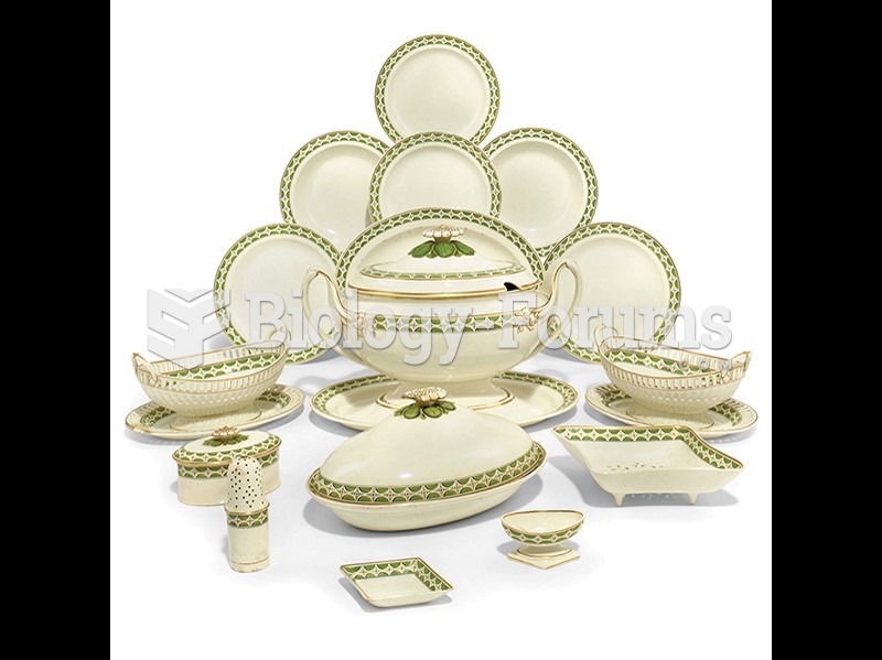 Josiah Wedgwood, Queen's Ware dinner service (detail).
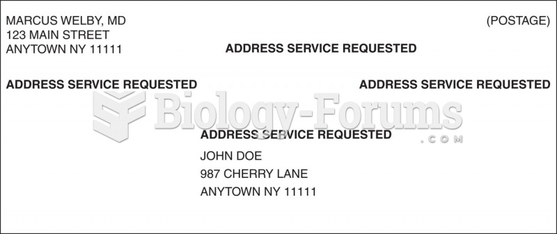 Envelope showing four options for placement of ancillary service endorsements.
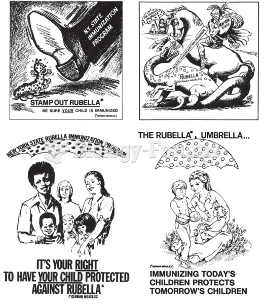 Ads from the public service campaign in the late 1960s and early 1970s that encouraged people to get ...
 How to calculate present value (Question 4)
 Opener Chiasmata present between synapsed homologs during the first meiotic prophase