Answer to Question 1
Answer: The correlation coefficient would be zero in this case, since the relationship is non-linear.
Answer to Question 2
Answer:
ahe
Mean 19.79
Standard Error 0.51
Median 16.83
Mode 19.23
Standard Deviation 11.49
Sample Variance 131.98
Kurtosis 0.23
Skewness 0.96
Range 58.44
Minimum 2.14
Maximum 60.58
Sum 9897.45
Count 500.0
The mean is 19.79. The median (16.83) is lower than the average, suggesting that the mean is being pulled up by individuals with fairly high average hourly earnings. This is confirmed by the skewness measure, which is positive, and therefore suggests a distribution with a long tail to the right. The variance is 2131.96, while the standard deviation is 11.49.
To generate the frequency distribution in Excel, you first have to settle on the number of class intervals. Once you have decided on these, then the minimum and maximum in the data suggests the class width. In Excel, you then define bins (the upper limits of the class intervals). Sturges's formula can be used to suggest the number of class intervals (1+3.31log(n) ), which would suggest about 9 intervals here. Instead I settled for 8 intervals with a class width of 8 minimum wages in California are currently 8 and approximately the same in other U.S. states.
The table produces the absolute frequencies, and relative frequencies can be calculated in a straightforward way.
bins Frequency rel. freq.
8 50 0.1
16 187 0.374
24 115 0.23
32 68 0.136
40 38 0.076
48 33 0.066
56 8 0.016
66 1 0.002
More 0
Substitution of the relative frequencies into the histogram table then produces the following graph (after eliminating the gaps between the bars).


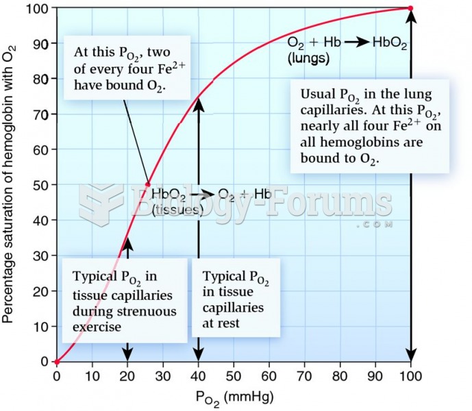 The human oxygen-hemoglobin dissociation curve.
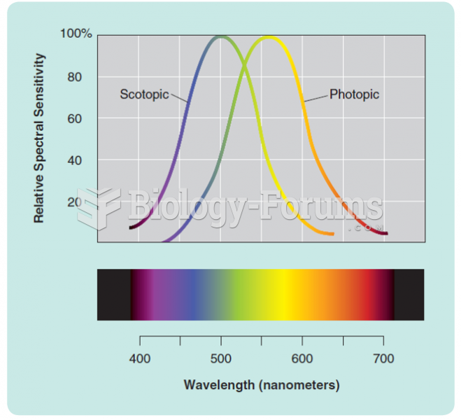 Human photopic (cone) and scotopic (rod) spectral sensitivity curves. The peak of each curve has ...
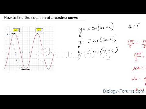 How to find the equation of a cosine curve
 Construct a Lorenz curve that shows income distribution in this society.
 Table - Correlation Analysis
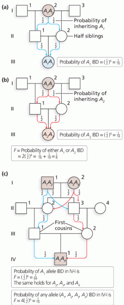 Calculation of the inbreeding coefficient (F)