Answer to Question 1
A histogram is used to convey the distribution of a quantitative variable. The horizontal axis represents the range of possible values for the variable of interest. The bars are joined together to form the distribution. A bar chart is used to illustrate a qualitative variable. By using gaps between the bars, the differences between the categories are more easily seen.
Answer to Question 2
A line chart is used to display data that are measured in sequence over time. The points are in a defined order. Connecting the points serves to illustrate any trend that may be present in the data. A scatter plot is used to show the relationship between two variables. The XY data points are plotted in a two-dimensional space. The order that the XY points are recorded is of no consequence, so connecting the points would be meaningless.

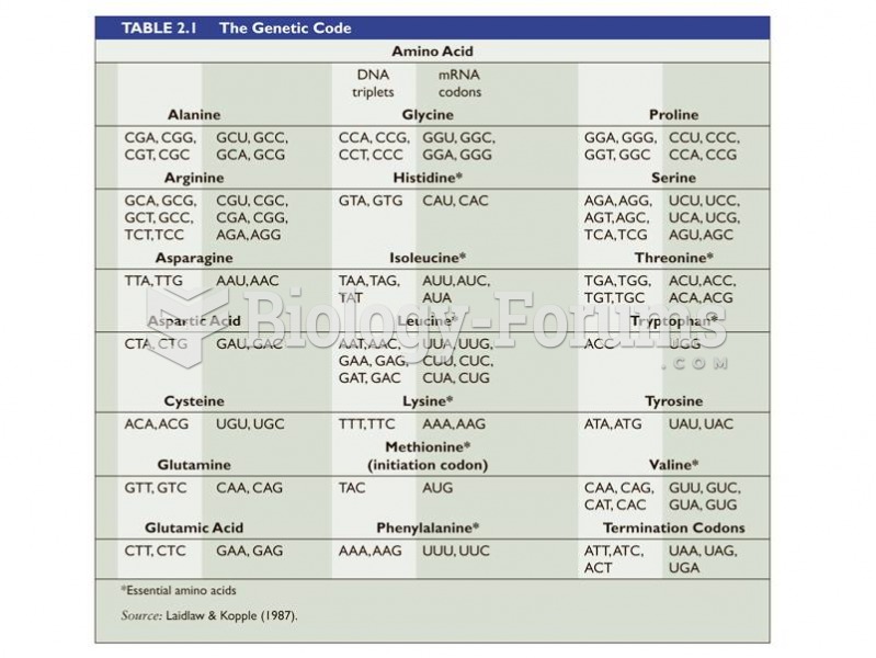 Amino acids chart
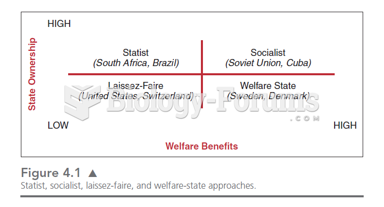 This chart illustrates the four quadrants in which we can place the relationships between the state
 Reflexology chart showing location of reflexes with corresponding anatomical structures and organs ...
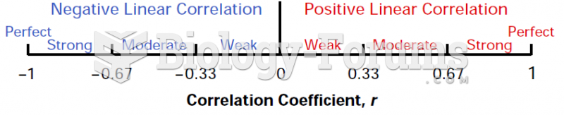 Correlation Coefficient, r (Chart)
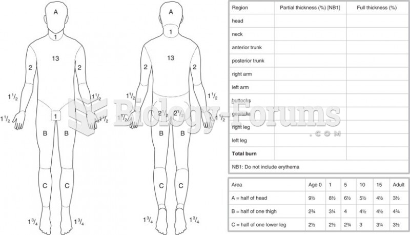 The Lund and Browder Chart
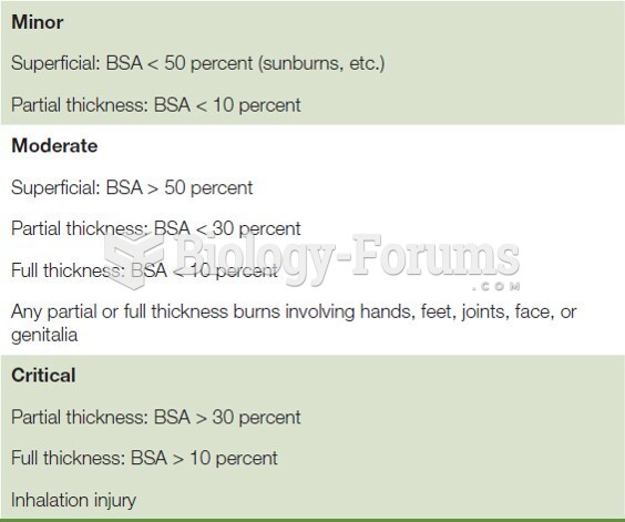 Burn Severity Chart