|
|
|

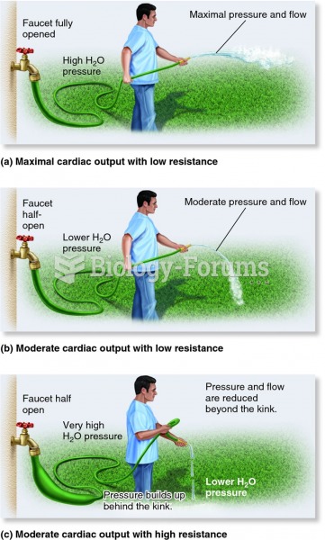 An analogy for how cardiac output, resistance, and blood pressure are related.
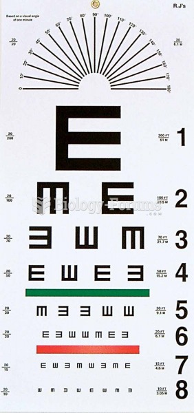 Snellen chart.
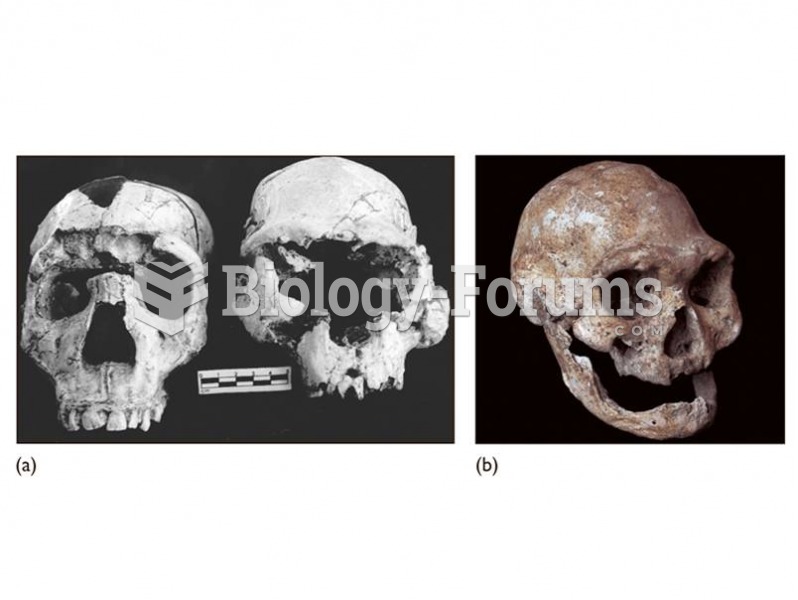 (a) The Dmanisi cranium (right) shows similarities to early African H. erectus including the Narioko
 Localization of a Peptide The peptide is revealed by means of immunocytochemistry. The photomicrogra
 This photo shows a newborn baby minutes after birth.
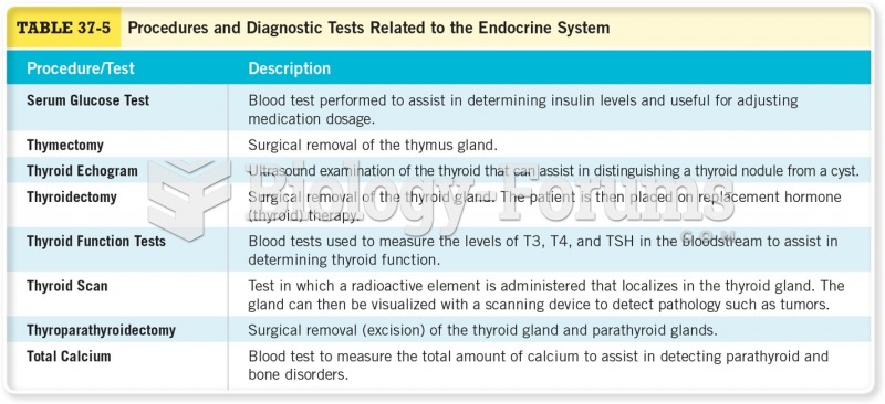 Procedures and Diagnostic Tests Related to the Endocrine System