|
|
|

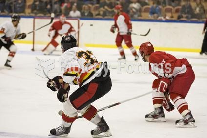 Head impact during sports may reduce ability to acquire new information
 Comet Tempel 1 67 seconds after colliding with the Deep Impact probe.
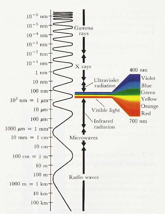 Electromagnetic Radiation Chart
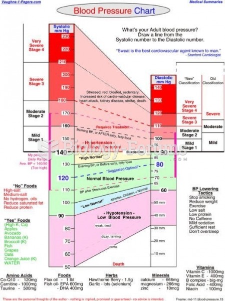 Blood Pressure Chart
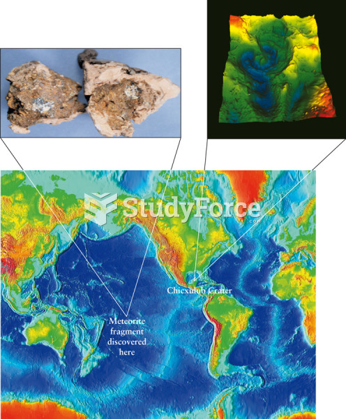 Confirming an Extinction-Level Impact Site
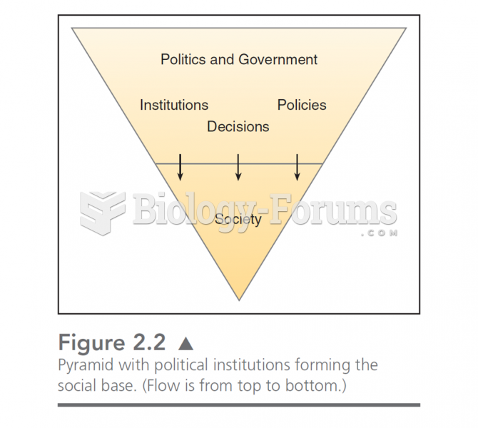 This chart illustrates the “drip down” model of government. In this, politics is formed by the soc