|
|
|

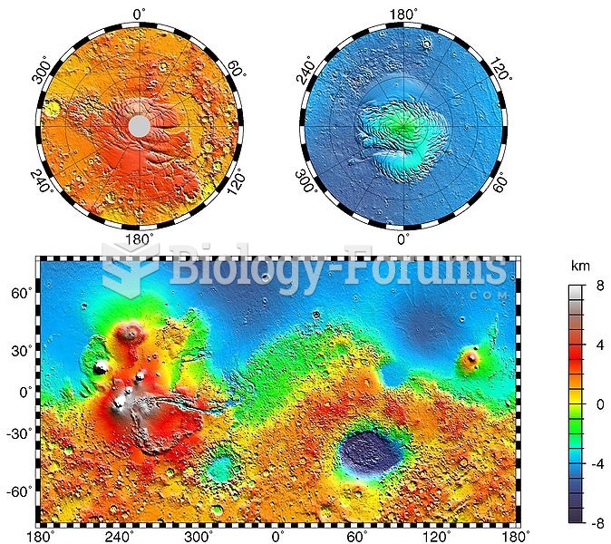 Volcanic plateaus (red) and impact basins (blue) dominate this topographic map of Mars
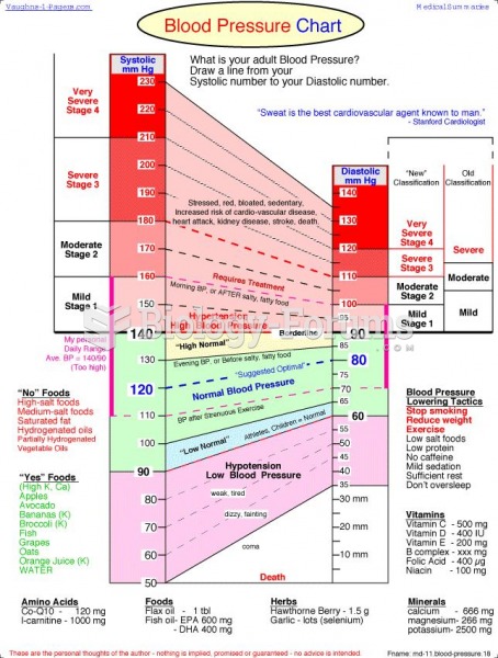 Blood Pressure Chart
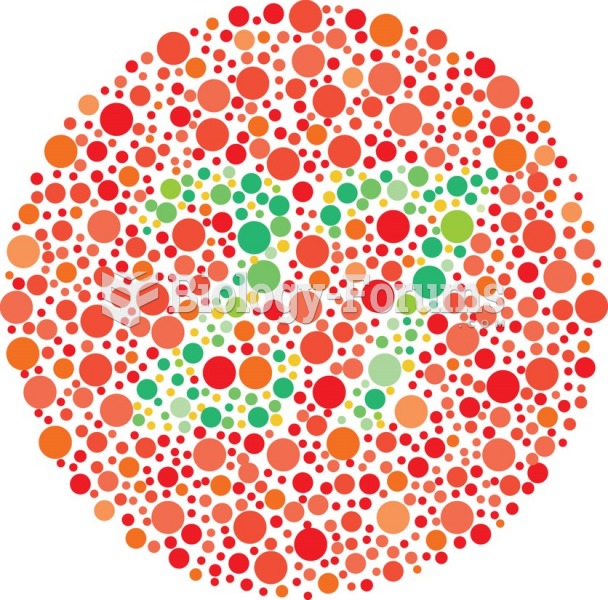 One page of color vision chart.
 The impact of endocrine disruptor on animal
 The impact of climate change on natural ecosystems
 linear programming problem, applying simplex method and sensitivity analysis