|
|
|

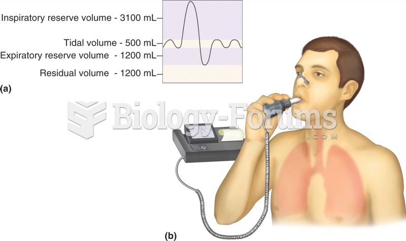 Pulmonary function test: spirometry. (a) Normal respiratory volumes, as measured during spirometry.
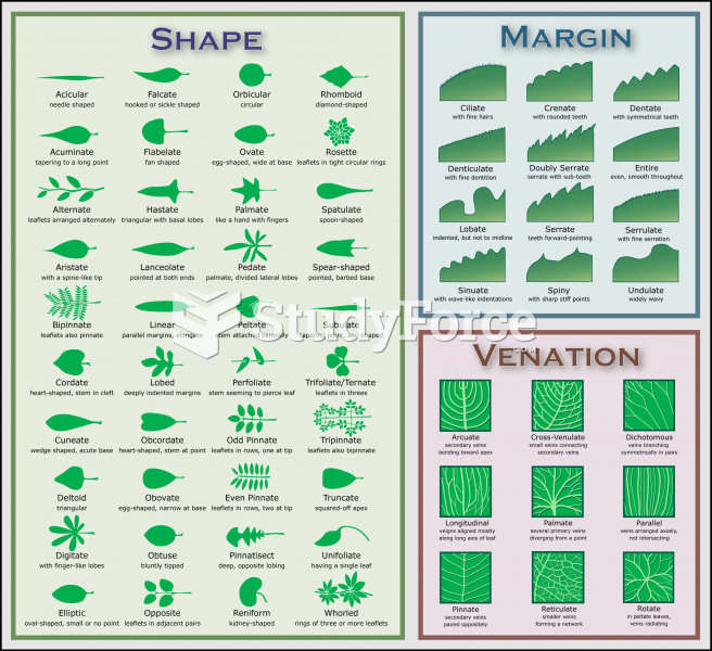 Plant Identification Chart
 Pelli-Robson contrast sensitivity chart.
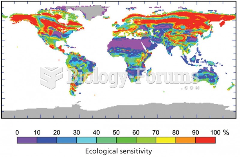 Ecological sensitivity to climate change
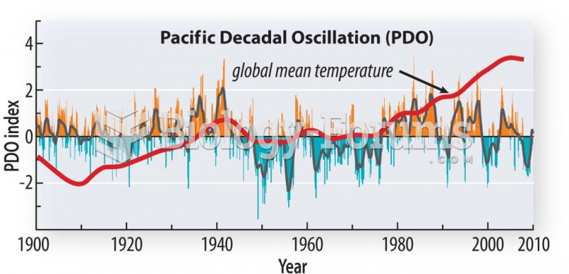 Correlates well with global temperature prior to the impact of GHG emissions
 Consequences of sleep deprivation flow chart