Figure 13.3 charts the course of voter participation in presidential elections from 1824 to the present. Which decade saw the highest percentile of eligible voters?
a. the 1890s
b. the 1930s
c. the 1980s
d. the 2000s
Question 2
The lifestyle-change theory suggests that one reason for decreased participation in elections is that people are __________.
a. cynical about the campaign and election process
b. now too busy to make time for voting
c. no longer confident in the government
d. less interested in politics as a whole

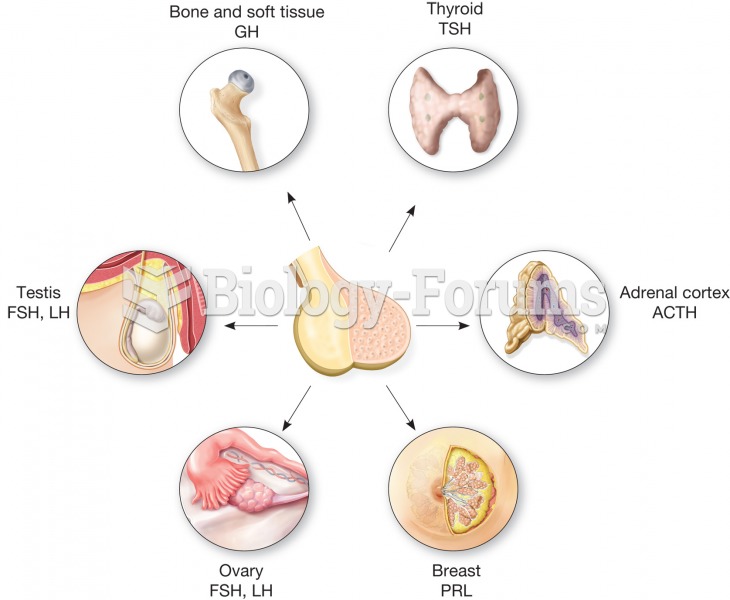 The anterior pituitary is sometimes called the master gland because it secretes many hormones that r
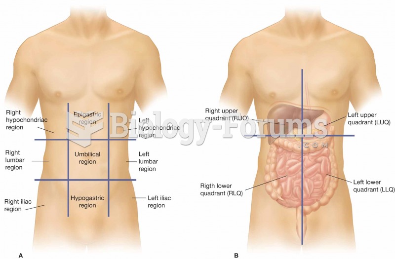 (A) The nine regions of the abdominopelvic cavity. (B) The four regions of the abdomen, which are re
 Table 6.1 illustrates the main regime types and their differences. It breaks the regimes into four
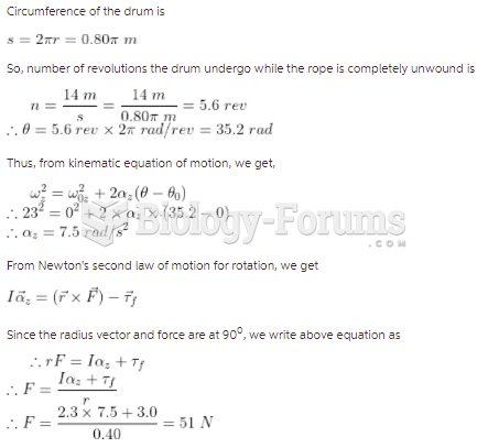 The drum shown in the figure has a radius of 0.40 m and a moment of inertia of 2.3 kg m2about ...
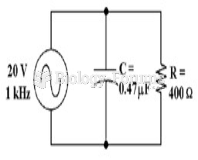 How much voltage does the resistor drop in Figure 10-2? a. 59 mV b. 19.94 V c. 20 V d. 10 V
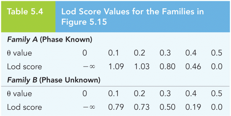 Lod Score Values for the Families in Figure 5.15