Figure 13.3 charts the course of voter participation in presidential elections from 1824 to the present. Which decade saw the highest percentile of eligible voters?
a. the 1890s
b. the 1930s
c. the 1980s
d. the 2000s
Question 2
The lifestyle-change theory suggests that one reason for decreased participation in elections is that people are __________.
a. cynical about the campaign and election process
b. now too busy to make time for voting
c. no longer confident in the government
d. less interested in politics as a whole

 Demonstrate the Application of Triangular, Figure-Eight, and Tubular Bandages
 Apply scissoring between metatarsals and figure-8s on toe joints to mobilize the foot.
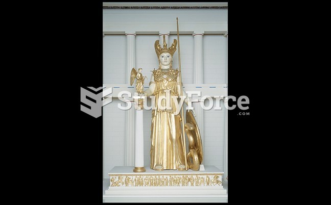 Re-creation of Pheidias’s Huge Gold and Ivory Figure of Athena
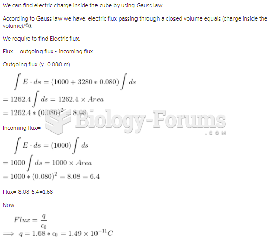 The cube of insulating material shown in the figure has one corner at the origin. Each side of ...
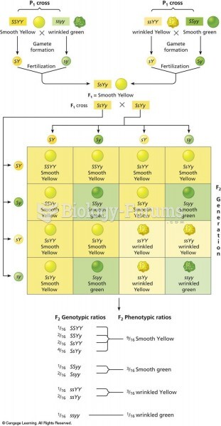 Punnett square of the dihybrid cross shown in Figure 3.8. There are two combinations of dominant and
 Frequency distribution of phenotypes from the possible offspring in Figure 5.7. Height of the offspr