|
|
|

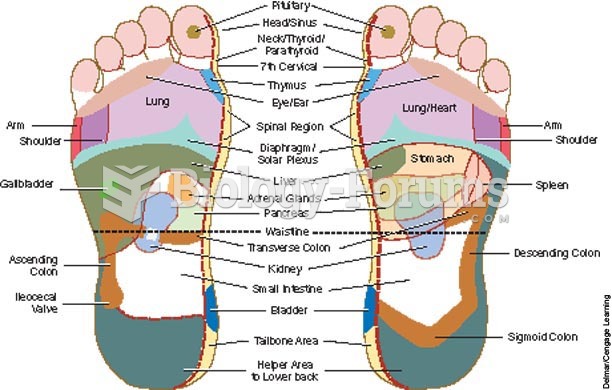 Foot reflexology chart indicates points on the foot that reflexively correspond to other areas of th
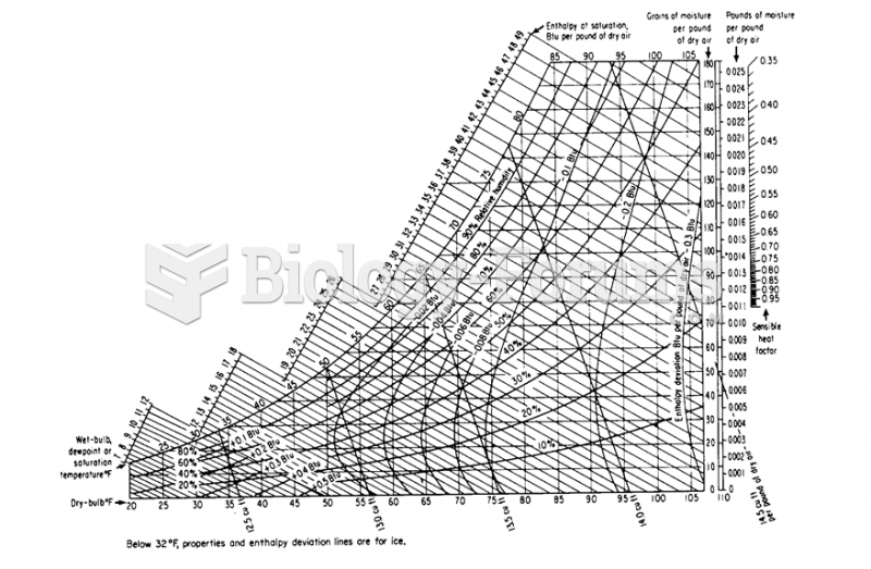 Humidity Chart
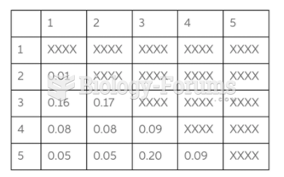 Chart
Chart
 Bio Chart
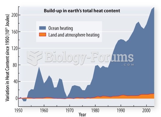 La Niña: The impact of natural cycles
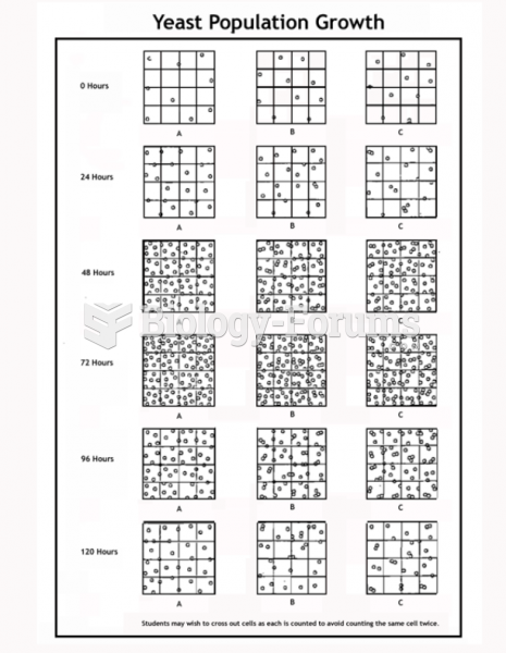
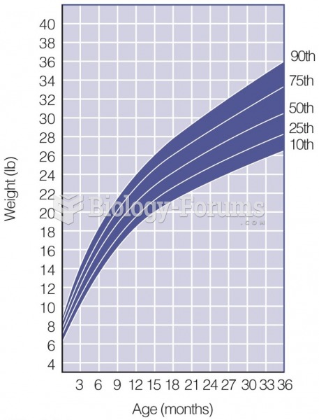 Growth Chart
|
|
|
Foot reflexology chart indicates points on the foot that reflexively correspond to other areas of th
Humidity Chart
Chart
Bio Chart
La Niña: The impact of natural cycles
Growth Chart
For a complete list of videos, visit our video library