This topic contains a solution. Click here to go to the answer
|
|
|

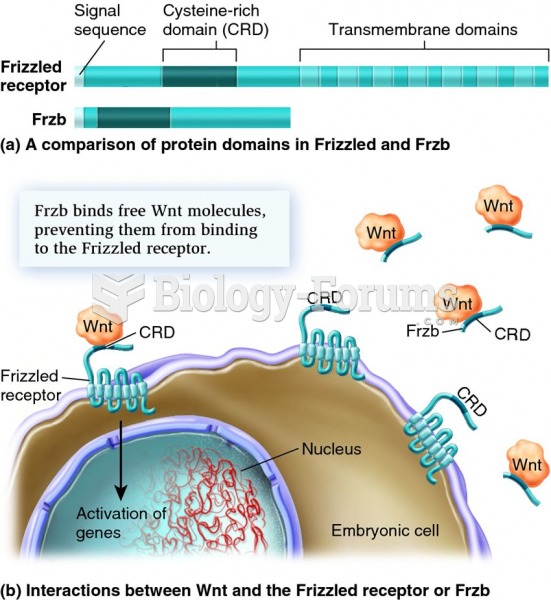 The actions of Frzb and the Frizzled receptor protein show how embryonic development represents a ba
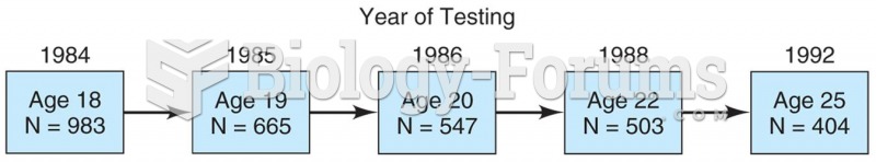 Model of a longitudinal study in which 983 students were surveyed in 1984 and then again in 1985, 19
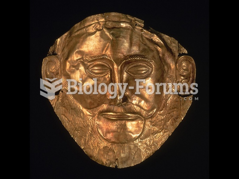 Funerary mask (Mask of Agamemnon), from Grave Circle A, Mycenae, Greece.
 How to evaluate angles using sine, special triangles, the unit circle (Part 1)
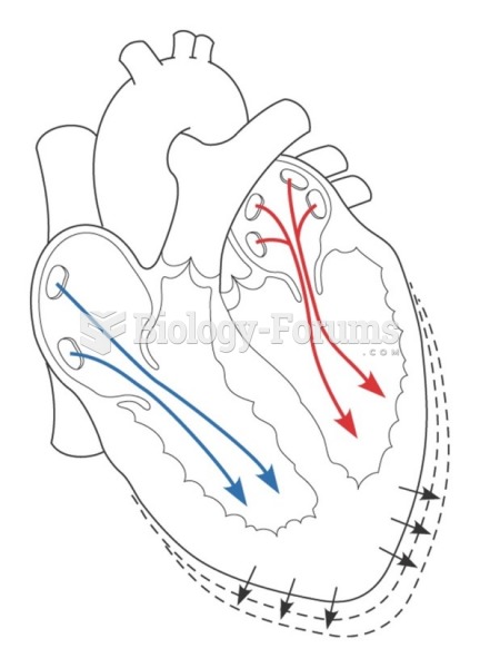 Preload is related to the amount of blood and stretching of the ventricular myocardial fibers
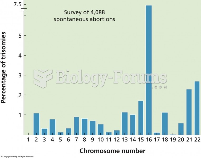 The results of a cytogenetic survey of over 4,000 miscarriages show a wide variation in how often sp