This topic contains a solution. Click here to go to the answer
|
|
|

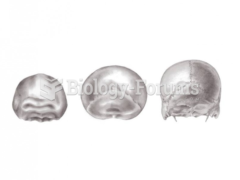 Posterior views of H. erectus, Neandertal, and modern H. sapiens show differences in vault shape.
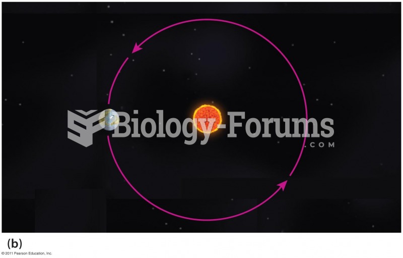 How Orbital Eccentricity Changes the Amount of Solar Radiation Earth Receives
 The Ford logo on display at the 2009 New York International Auto Show.
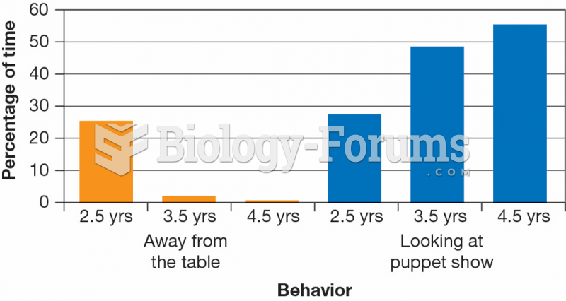 Age Differences in Attention to a Puppet Show Video
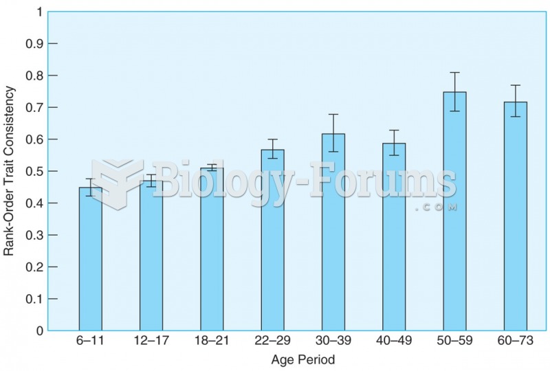 Rank-order correlations show that differential consistency remains high from childhood through late ...
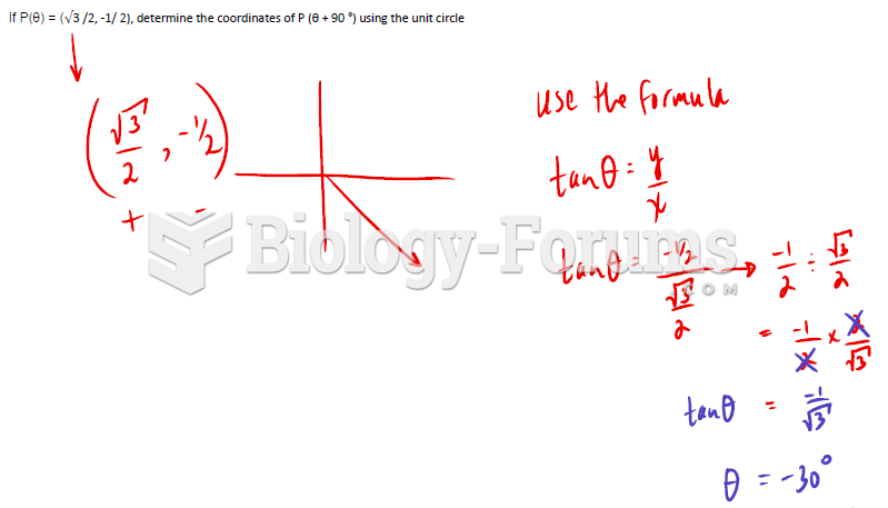 If P(θ) = (√3 /2, -1/ 2), determine the coordinates of P (θ + 90 °) using the unit circle