This topic contains a solution. Click here to go to the answer
|
|
|

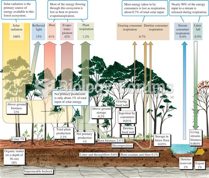 Energy budget for a temperate deciduous forest (data from Gosz et al. 1978).
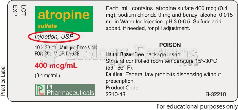 Some drug labels show the USP symbol; others do not.
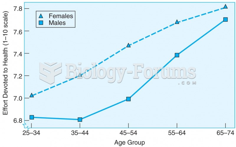 Cross-sectional data showing that the amount of effort spent on personal health care increases with
 The Typical Bureaucratic Structure of a Medium-Sized University
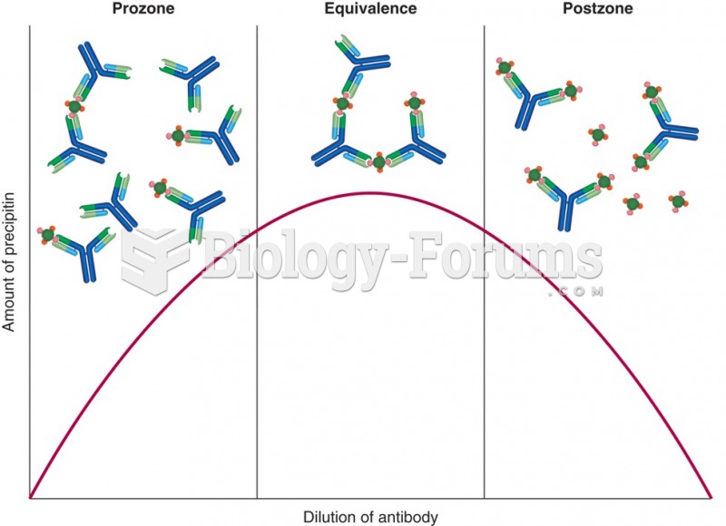 A depiction of the amount of precipitin that would form with different ratios of antigen and ...
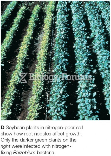 Soybean plants in nitrogen-poor soil show how root nodules affect growth. Only the darker green plan