This topic contains a solution. Click here to go to the answer
|
|
|

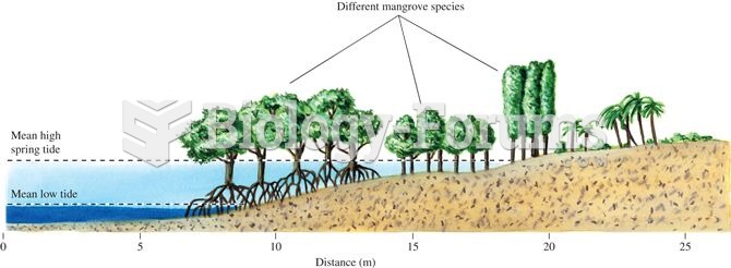 Where mangrove diversity is high, mangrove species show clear patterns of vertical zonation relative
 Pocket gophers and ecosystem structure (data from Huntly and Inouye 1988).
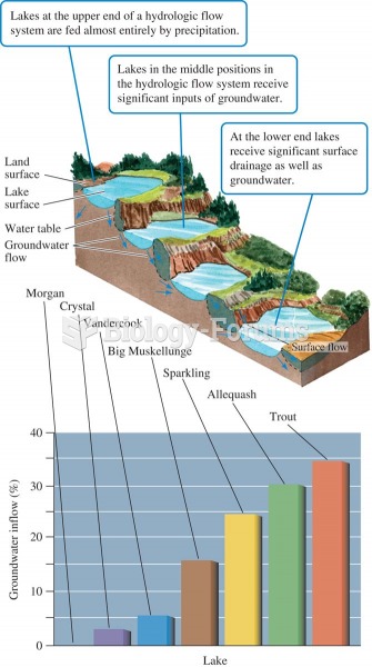 Lake position in the landscape and proportion of water received as groundwater (data from Webster et
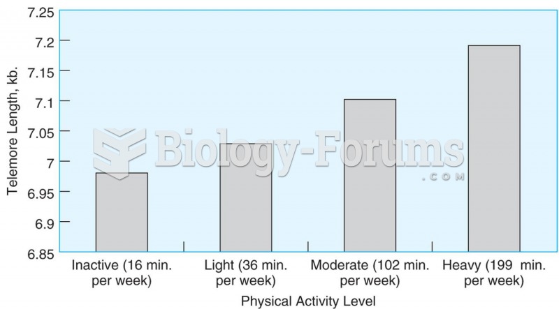 Telomere length is related to the amount of time adults spend in leisure time activity. Source: Ada
 Acquiring Weather Data
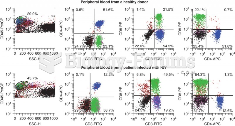 Flow data for a healthy donor (top panel) and a HIV positive patient. CD3 is a T-cell marker, CD4 is ...