|
|
|

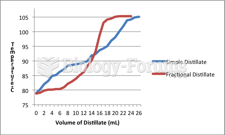 Distillation Graph Comparision
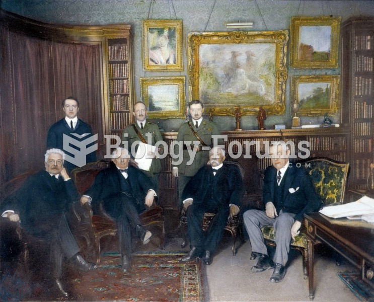 The “Big Four” world leaders meet at the Hotel Crillon in Paris, 1919. From left to right (front row
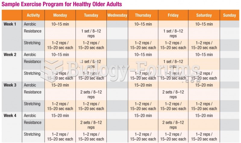 Sample Exercise Program for Healthy Older Adults
 Older adults may need special assistance with medications.
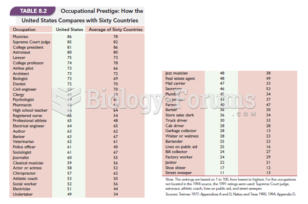 Occupational Prestige: How The United States Compares With Sixty Countries
 Dietary Needs of Older Adults