This topic contains a solution. Click here to go to the answer
|
|
|

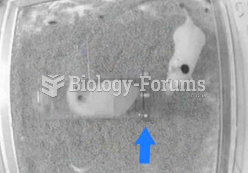 Rodents Show Empathy-Driven Behavior
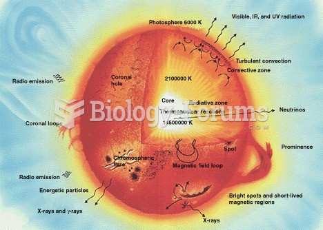 Internal structures of main sequence stars, convection zones with arrowed cycles and radiative zones
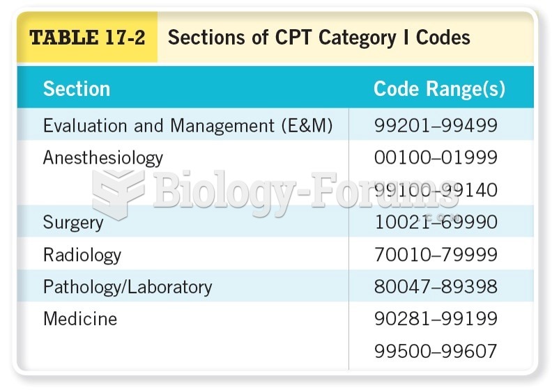 Sections of CPT Category I Codes
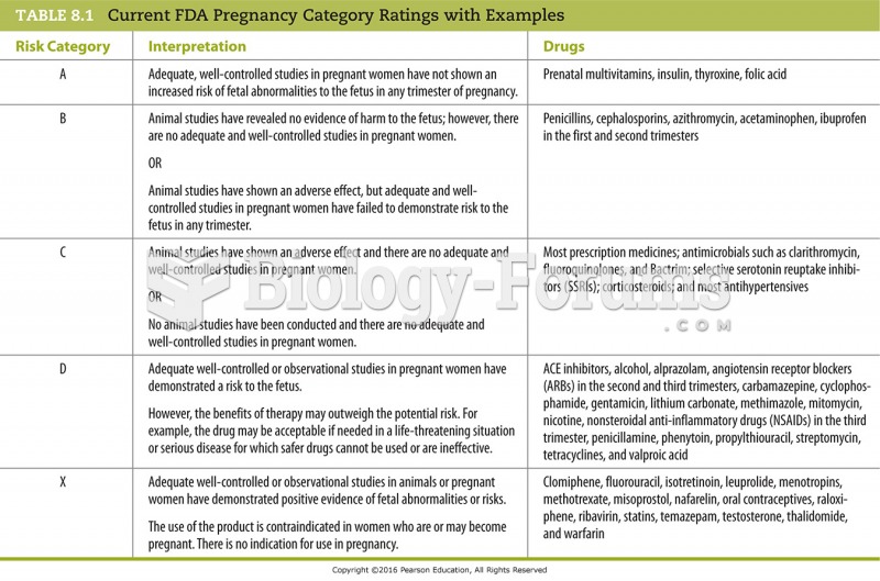 Current FDA Pregnancy Category Ratings with Examples
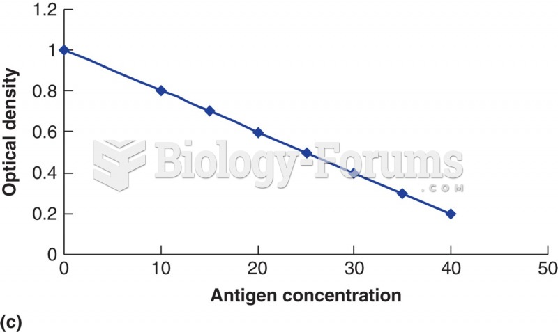 The relationship of substrate con- version (as measured by optical density) to the amount of patient ...
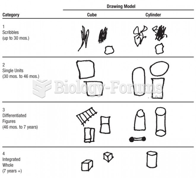 Examples of drawings in each category of two object forms