This topic contains a solution. Click here to go to the answer
|
|
|

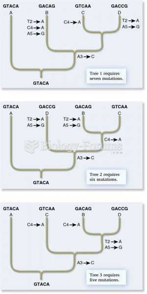 The cladistic approach from molecular genetic data
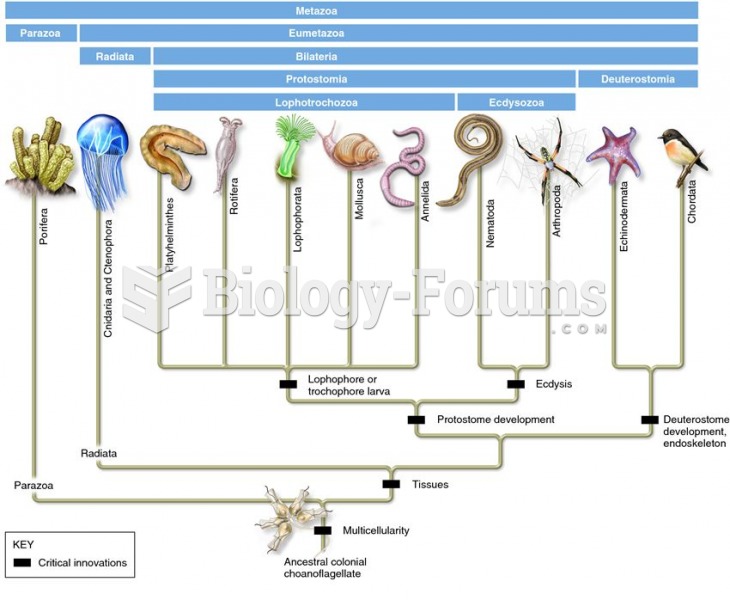 A revised animal phylogeny based on molecular data of SSU rRNA
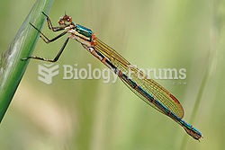 Lestidae is a rather small family of cosmopolitan, large-sized, slender damselflies. They are of the
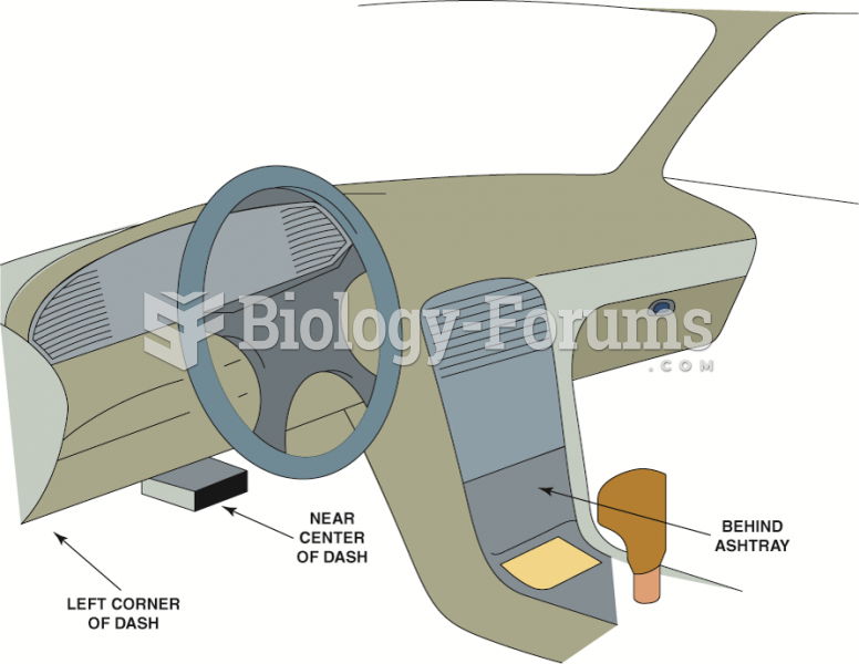 The data link connector (DLC) can be located in various locations.
 Data for Calculating Productivity Growth in Erewhon
 a solution is prepared in which a trace or small amount of Fe2+ is added to a much larger ...