|
|
|

 A melanistic jaguar is a colour morph which occurs at about 6% frequency in populations.
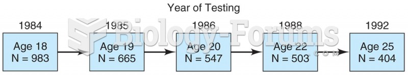 Model of a longitudinal study in which 983 students were surveyed in 1984 and then again in 1985, 19
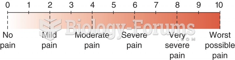 Numerical pain level chart with word modifiers.
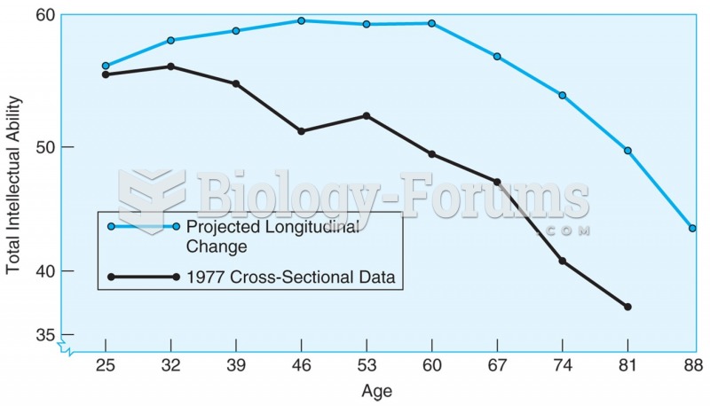 4.1 Age changes in total IQ based on cross-sectional data (lower line) and longitudinal data ...
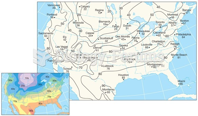 Air-Temperature Data
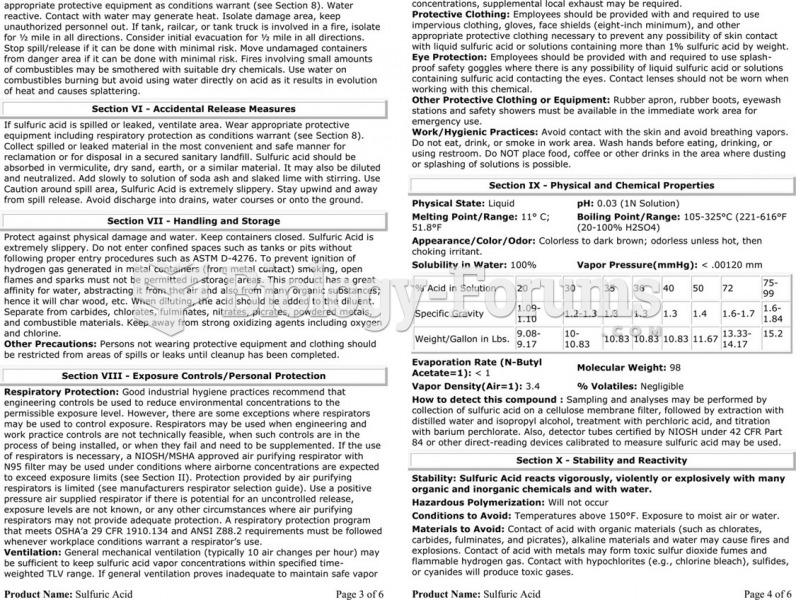 The material safety data sheet (MSDS) for sulfuric acid showing the detailed technical information ...