|
|
|

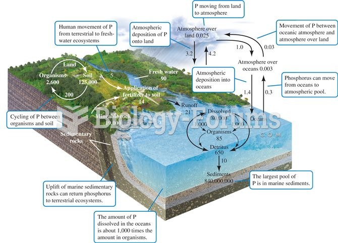 The phosphorus cycle. Numbers are 1012 g P or fluxes as 1012 g P per year (data from Schlesinger 199
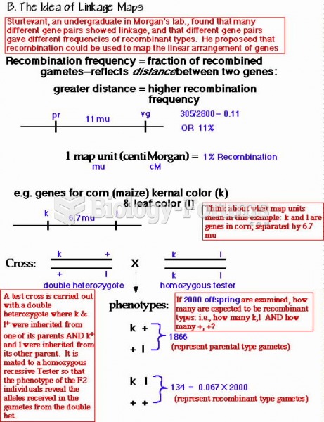 recombination frequency
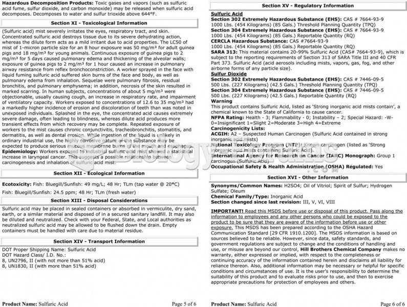 The material safety data sheet (MSDS) for sulfuric acid showing the detailed technical information ...
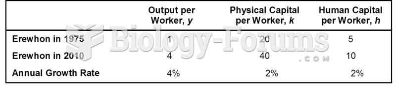 Data for Calculating Productivity Growth in Erewhon
 Demographic Data for India
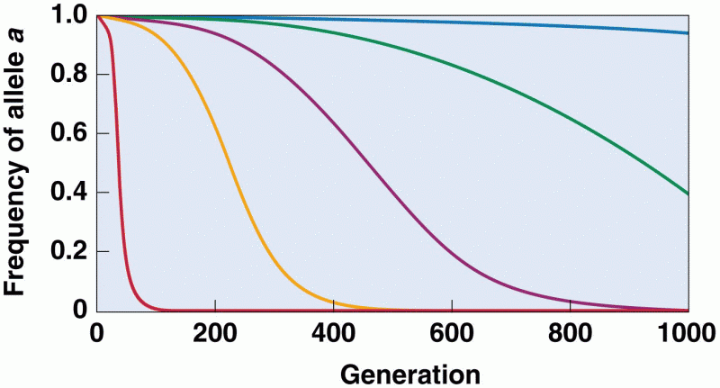 The effect of selection on allele frequency