|
|
|

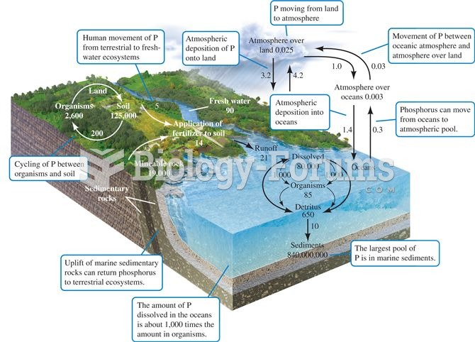 The phosphorus cycle. Numbers are 1012 g P or fluxes as 1012 g P per year (data from Schlesinger 199
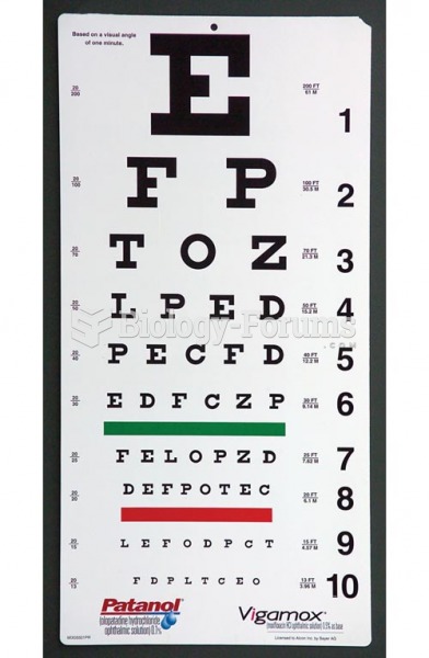 Visual Acuity Testing, Snellen Vision Chart
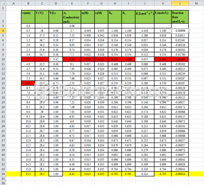 Fluidization - Data Table of experiment
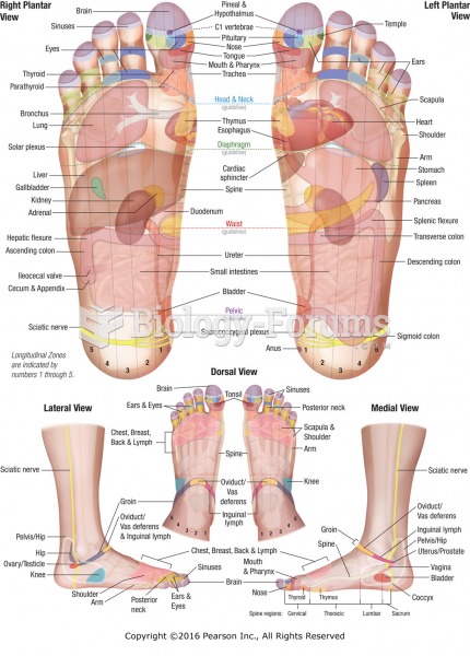 Reflexology chart showing location of reflexes with corresponding anatomical structures and organs ...
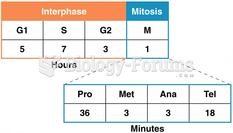 The time spent in each interval of one complete cell cycle of a human cell in culture
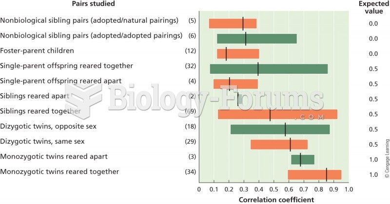 A graphical representation of correlations in IQ measurements in different sets of individuals. The