|
|
|

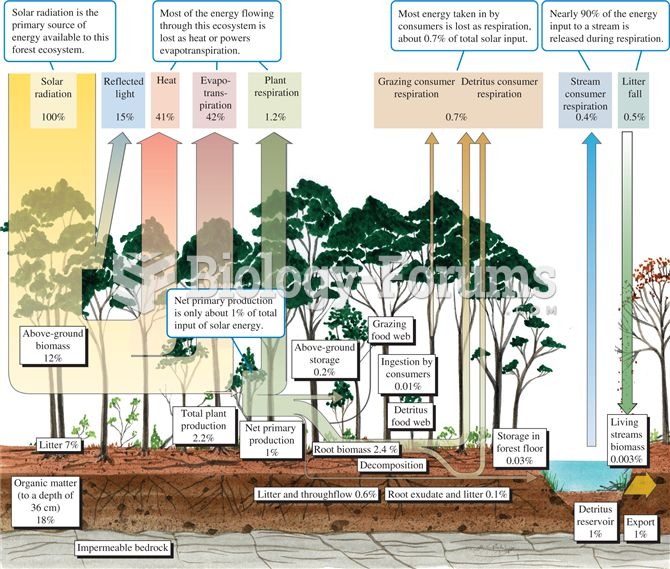 Energy budget for a temperate deciduous forest (data from Gosz et al. 1978).
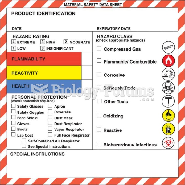 An example of a Material Safety Data Sheet (MSDS).
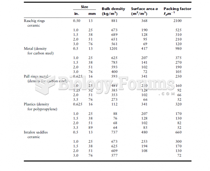 Design Data for Various Packings
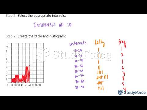 How to create a frequency table and histogram from raw data
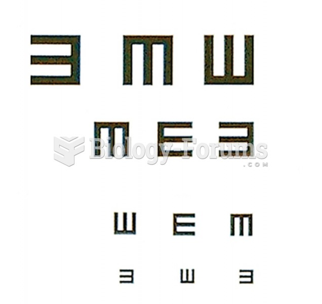 E chart for testing distant vision
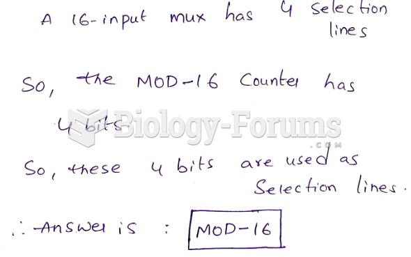 A 16-input multiplexer is to be used to perform parallel-to-serial data conversion. Which of ...