|
|
|

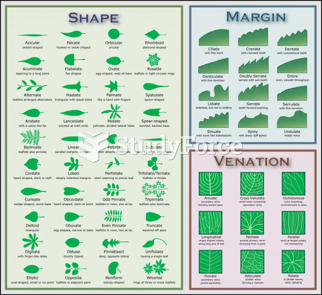 Plant Identification Chart
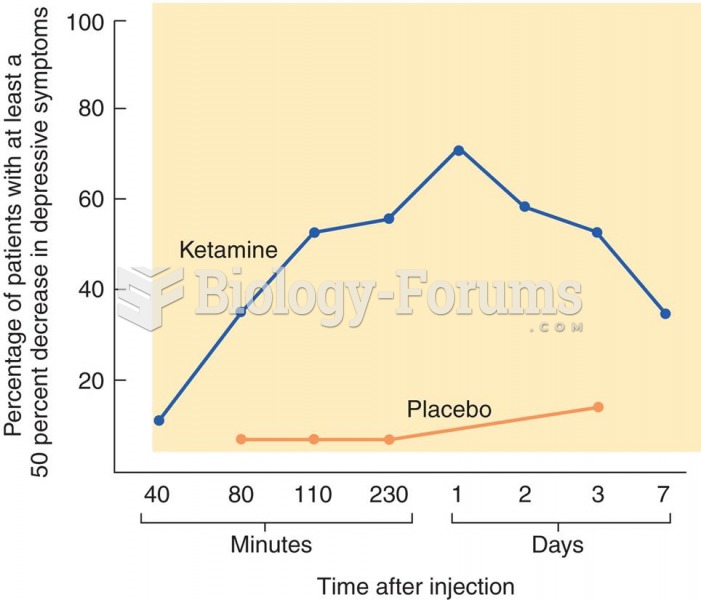 Treatment of Depression with Ketamine The graph shows the effects of ketamine on symptoms of depress
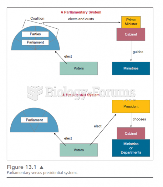 This chart shows the various lines of responsibility and how they differ in presidential and parliam
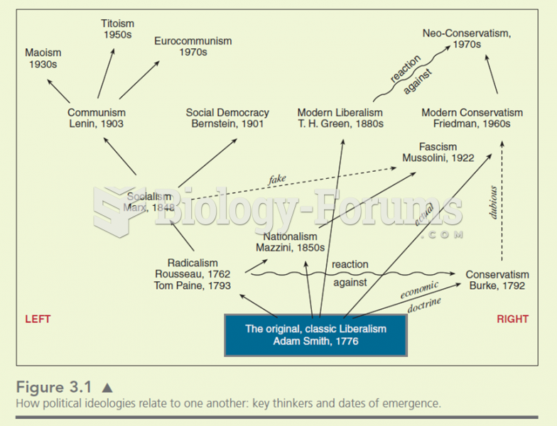 Many ideologies stem from older theories. The ideas of the philosophers are simplified. Ideologies
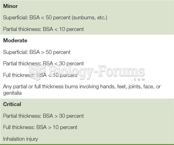 Burn Severity Chart
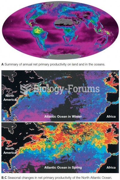 Satellite data showing net primary production. Productivity is coded as red (highest) down through o